





Moody Wedding Theme Ideas: 8 Distinctive Looks to Inspire Your Day
A moody wedding theme can take many forms. It might mean burgundy flowers against black linens, plum blooms softened by beige draping, or an unexpected mix of teal and burnt orange. What these looks share is a sense of depth, built through color, floral shapes, fabrics, and the details surrounding them. If you love a wedding aesthetic with a little more richness and character, these eight themes offer different ways to make it your own.
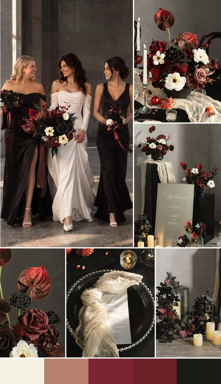
Editorial Black & Burgundy
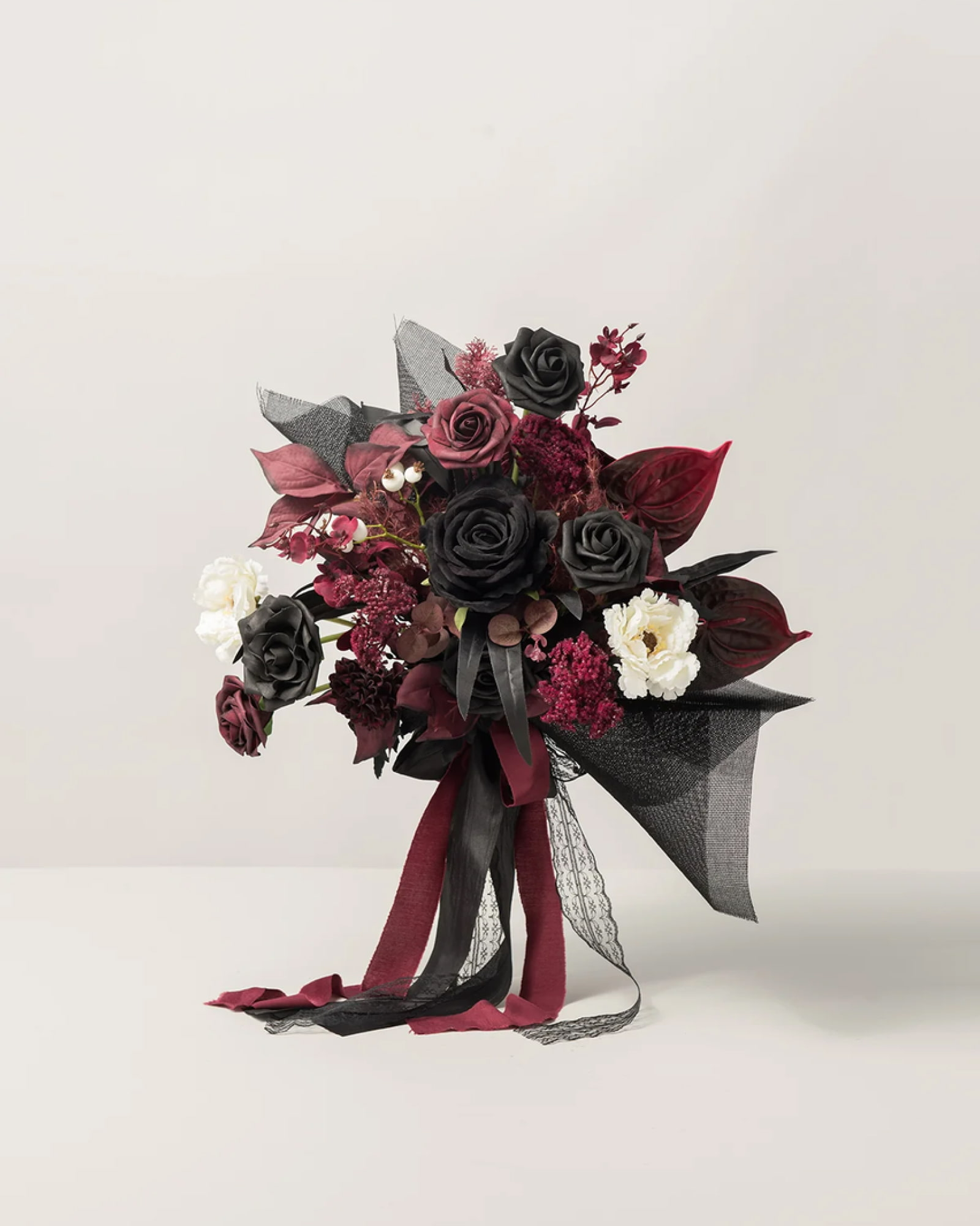
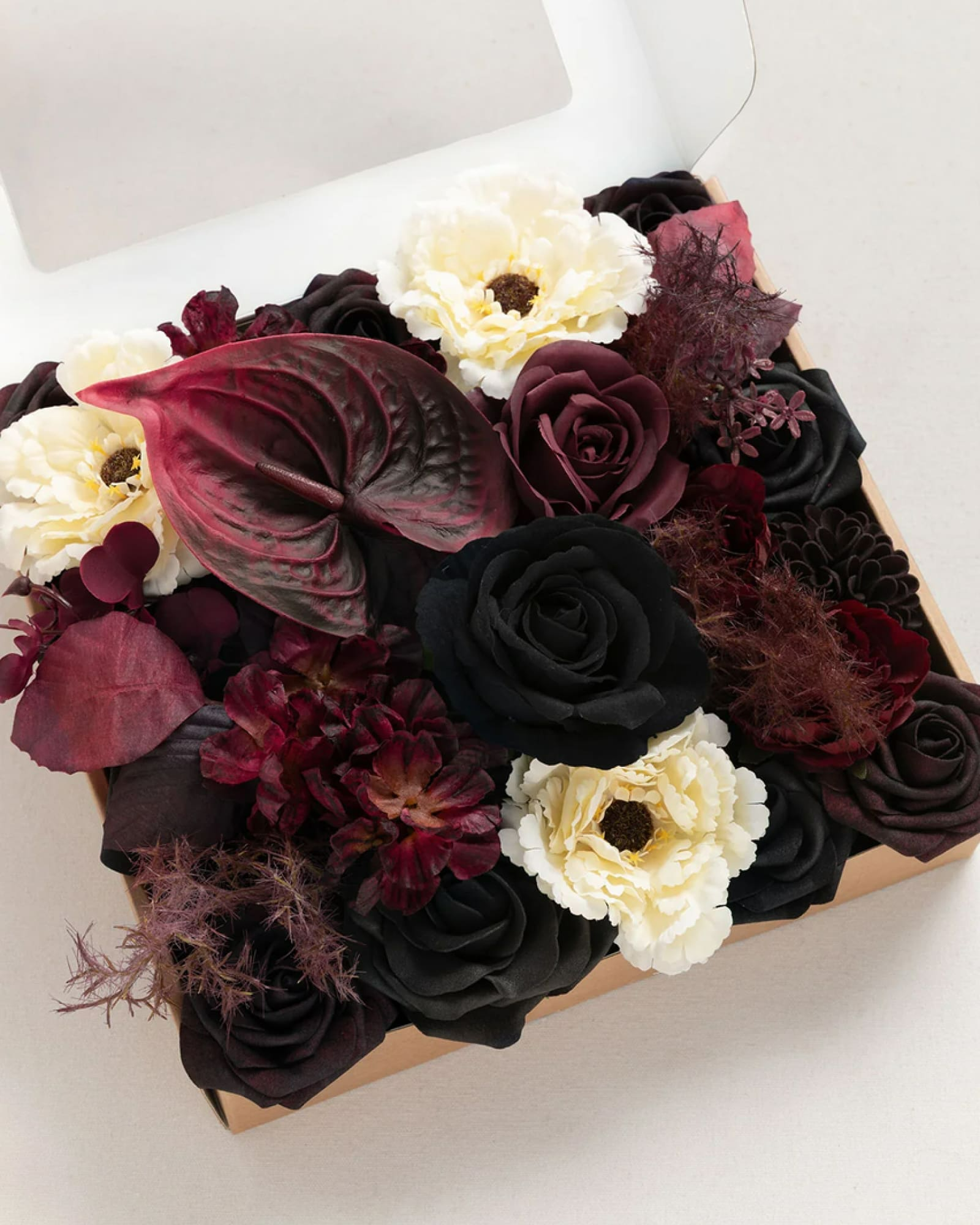
Black and burgundy make a natural pairing, but the flower choices are what give this look its editorial edge. Deep red blooms establish the intensity, while sculptural anthuriums introduce a sharper, more architectural shape. Ivory flowers offer a visual pause against the darker palette, keeping the arrangements from becoming one continuous block of color. With black linens and sleek metallic details, the result feels closer to a fashion spread than a traditional romantic reception.
Shop the Look
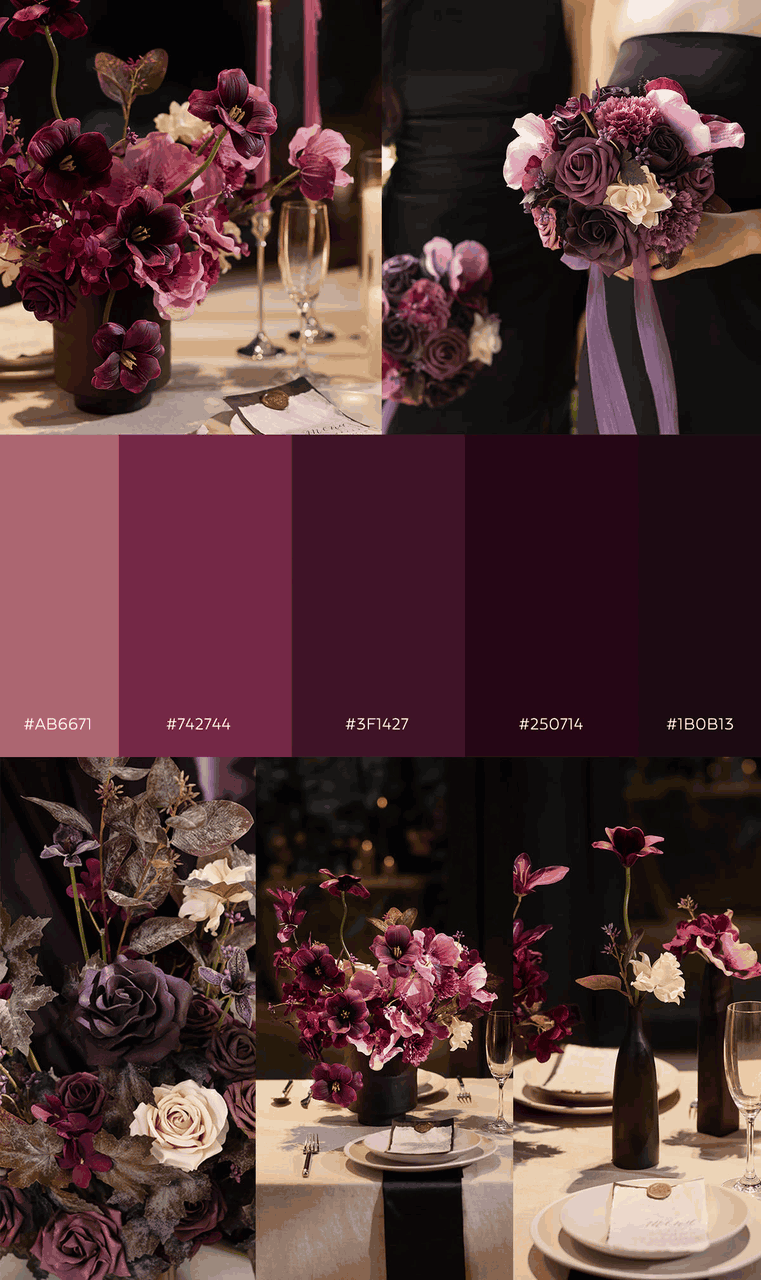
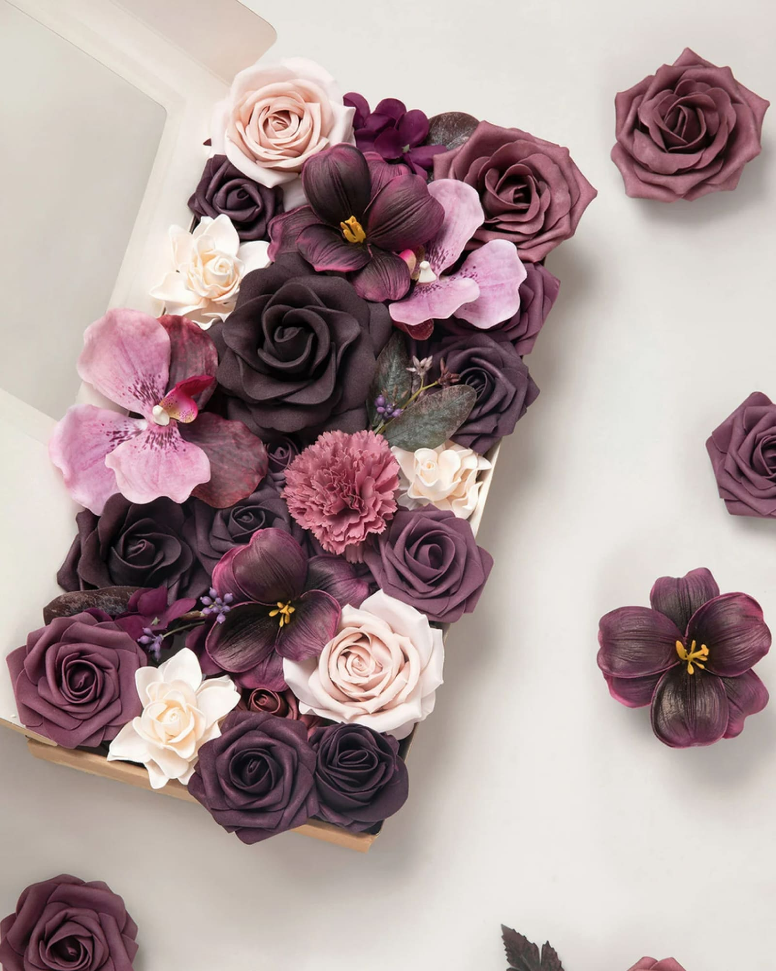
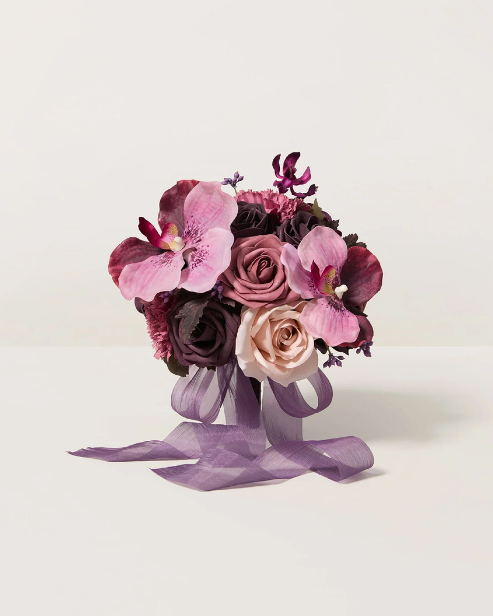
Minimal Plum & Black
A minimal wedding leaves little room for flowers to hide. Here, plum tulips and orchids do much of the visual work, their distinctive shapes and elongated lines giving the arrangements a sculptural quality. Black vessels and restrained styling keep attention on the blooms, while softer purple and dusty rose tones add variation. This is a useful direction for couples who want a strong floral statement but prefer to keep the surrounding decor pared back.
Shop the Look
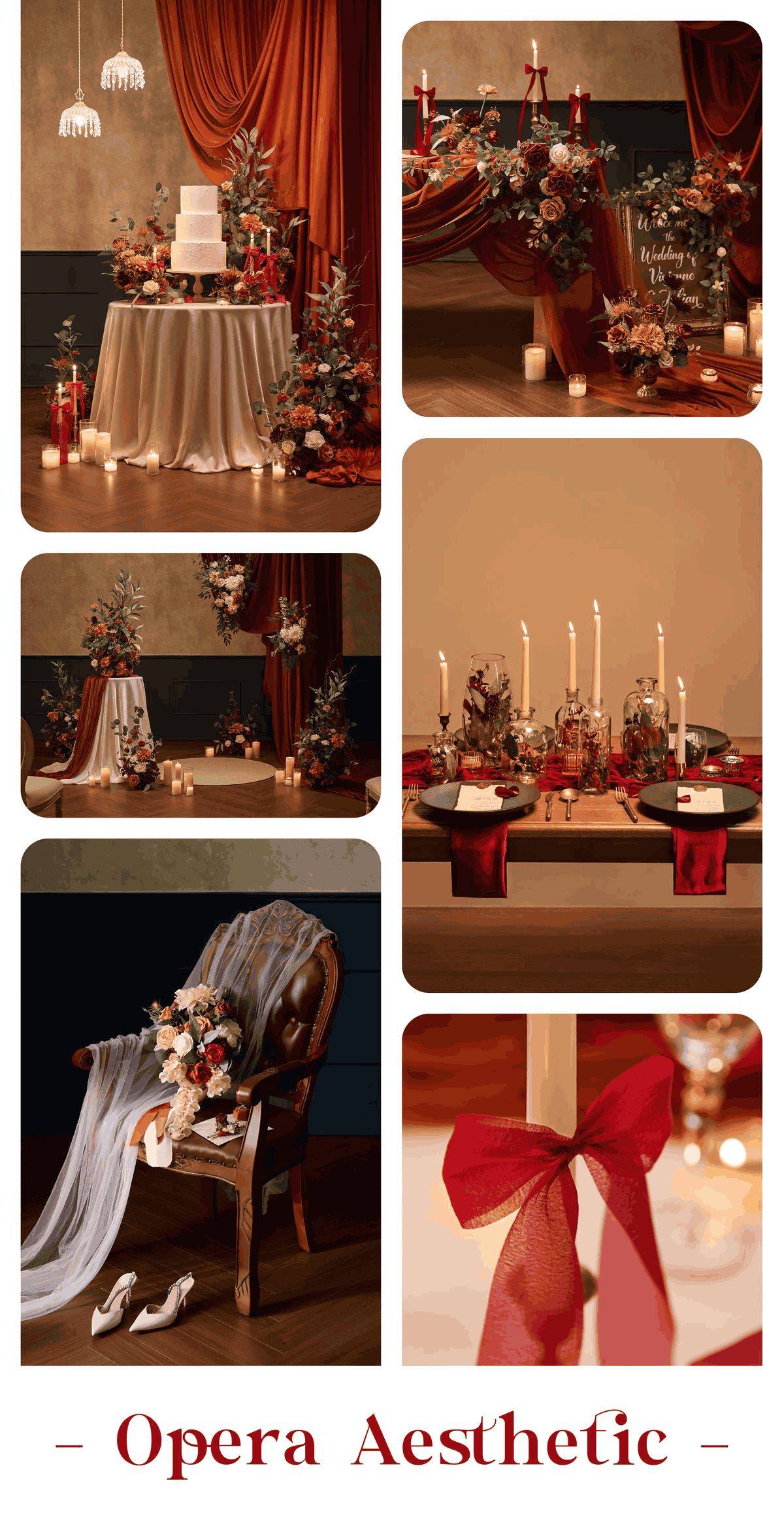
Theatrical Terracotta & Amber
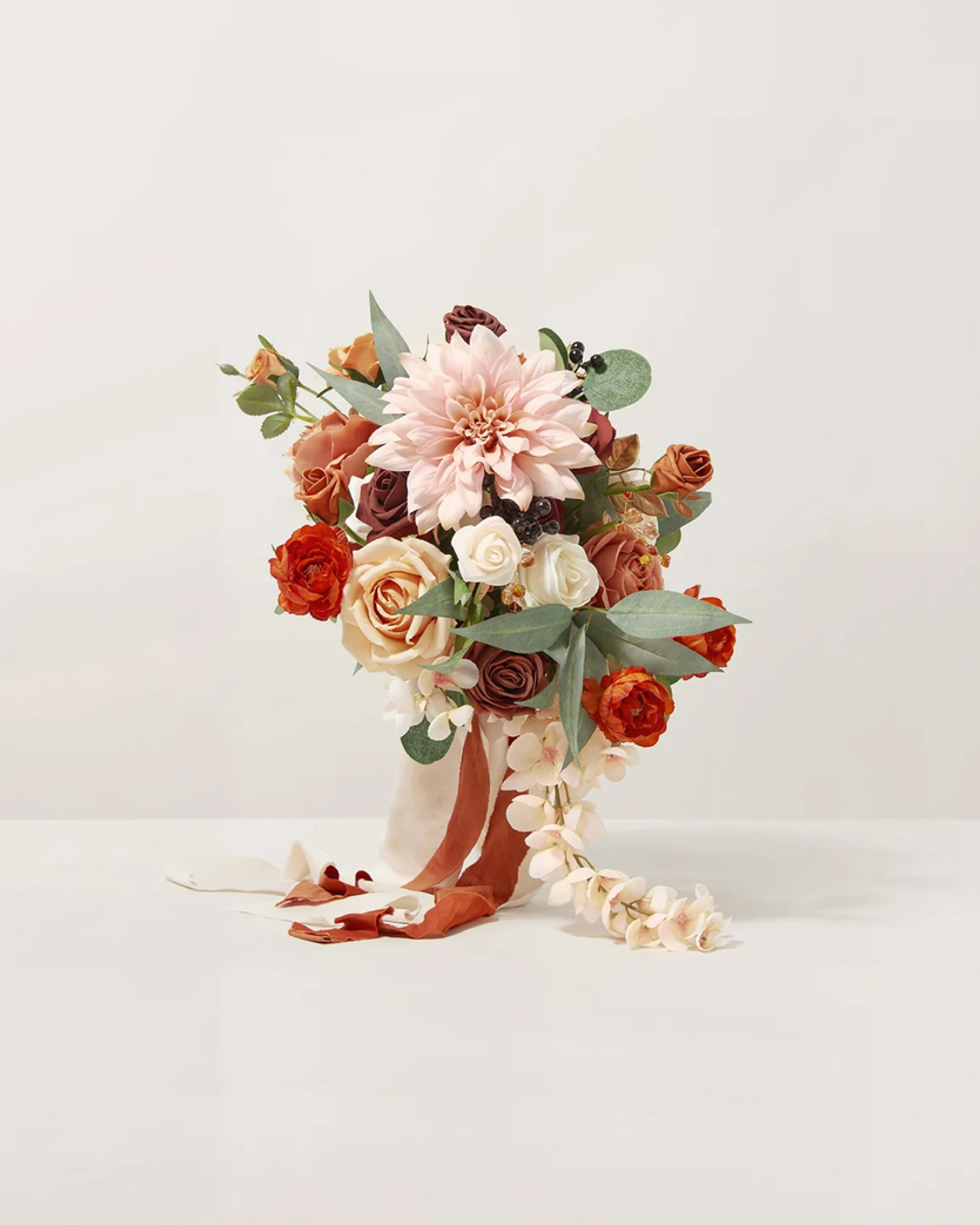
This theme feels as though it belongs on a stage. Caramel-toned draping establishes a warm backdrop, while terracotta, burnt orange, and burgundy flowers bring concentrated color into the scene. The warmth is important: instead of relying on black to create drama, the design builds intensity through layered autumnal shades. Cream accents can provide a little breathing room, allowing the richer colors to remain the focus.
Shop the Look
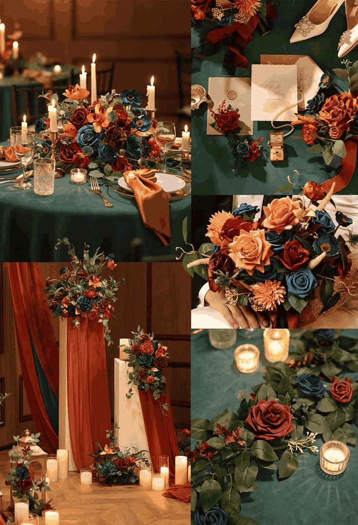
Vintage Teal & Burnt Orange
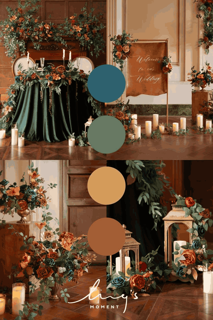
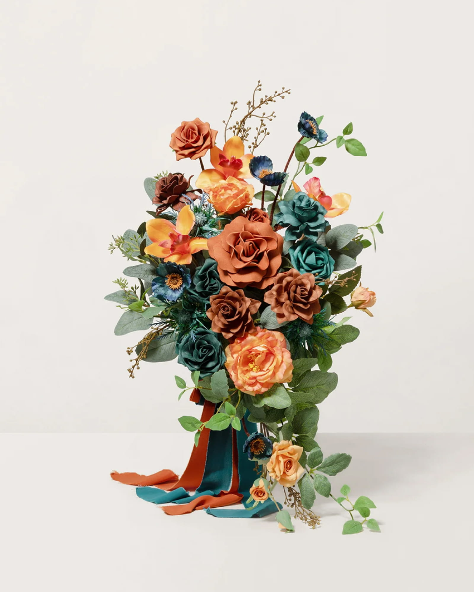
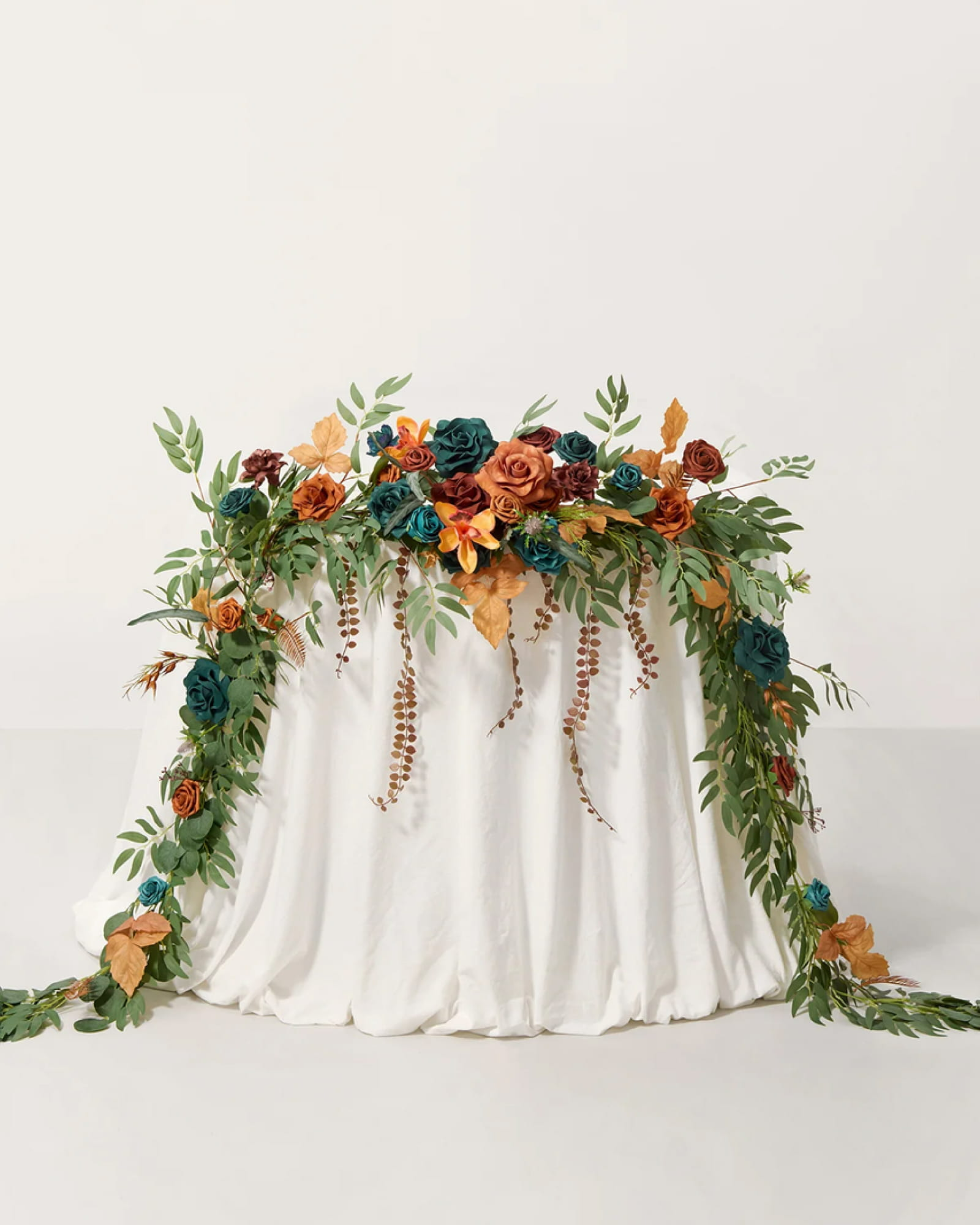
Teal and burnt orange are an unexpected pairing, and that is precisely their appeal. The cool blue-green tones give the palette a sense of depth, while burnt orange roses bring warmth and a more familiar floral softness. Emerald velvet deepens the vintage character, and cascading greenery keeps the arrangements from feeling too rigid. For couples drawn to richly colored, old-world interiors, this combination offers something more distinctive than a conventional burgundy-and-rust palette.
Shop the Look
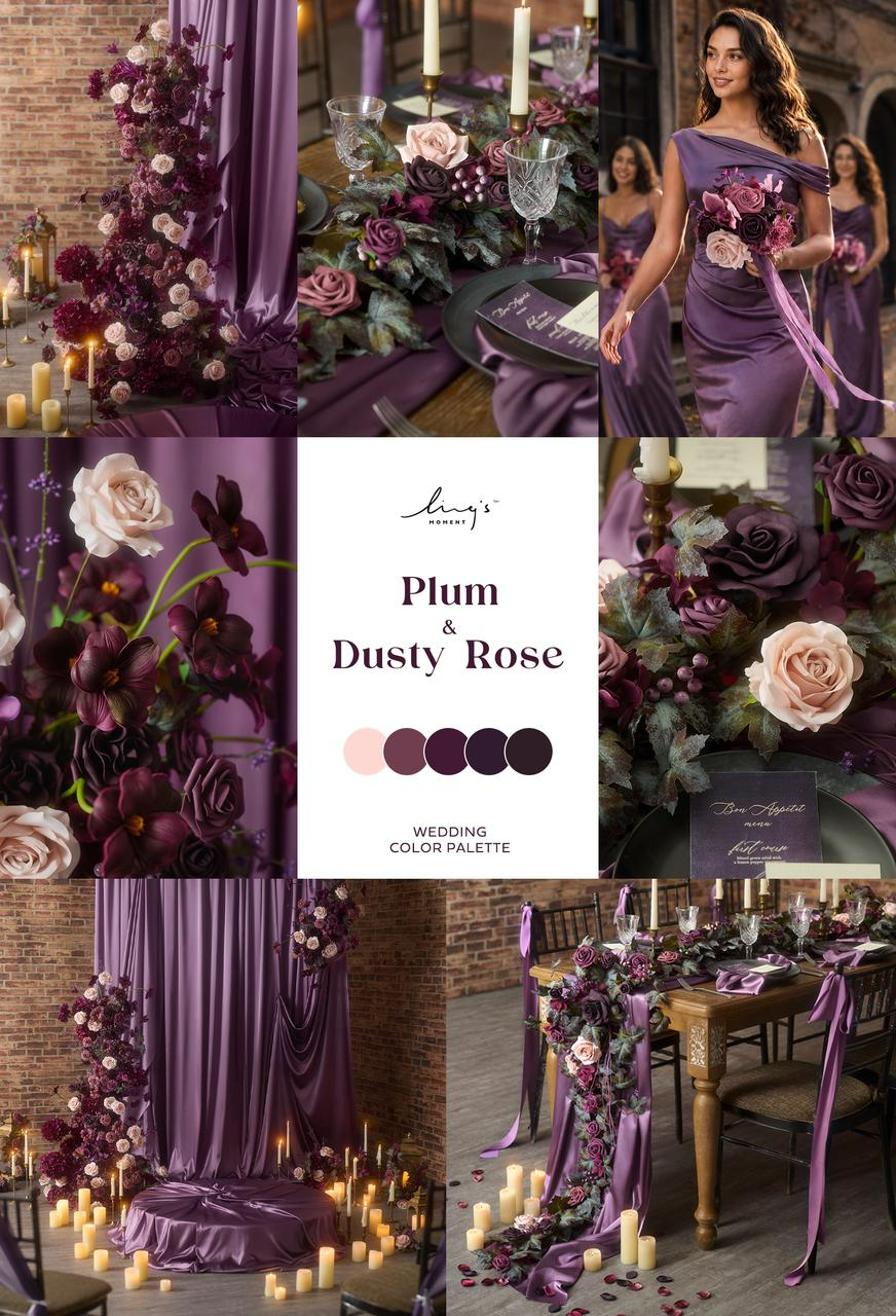
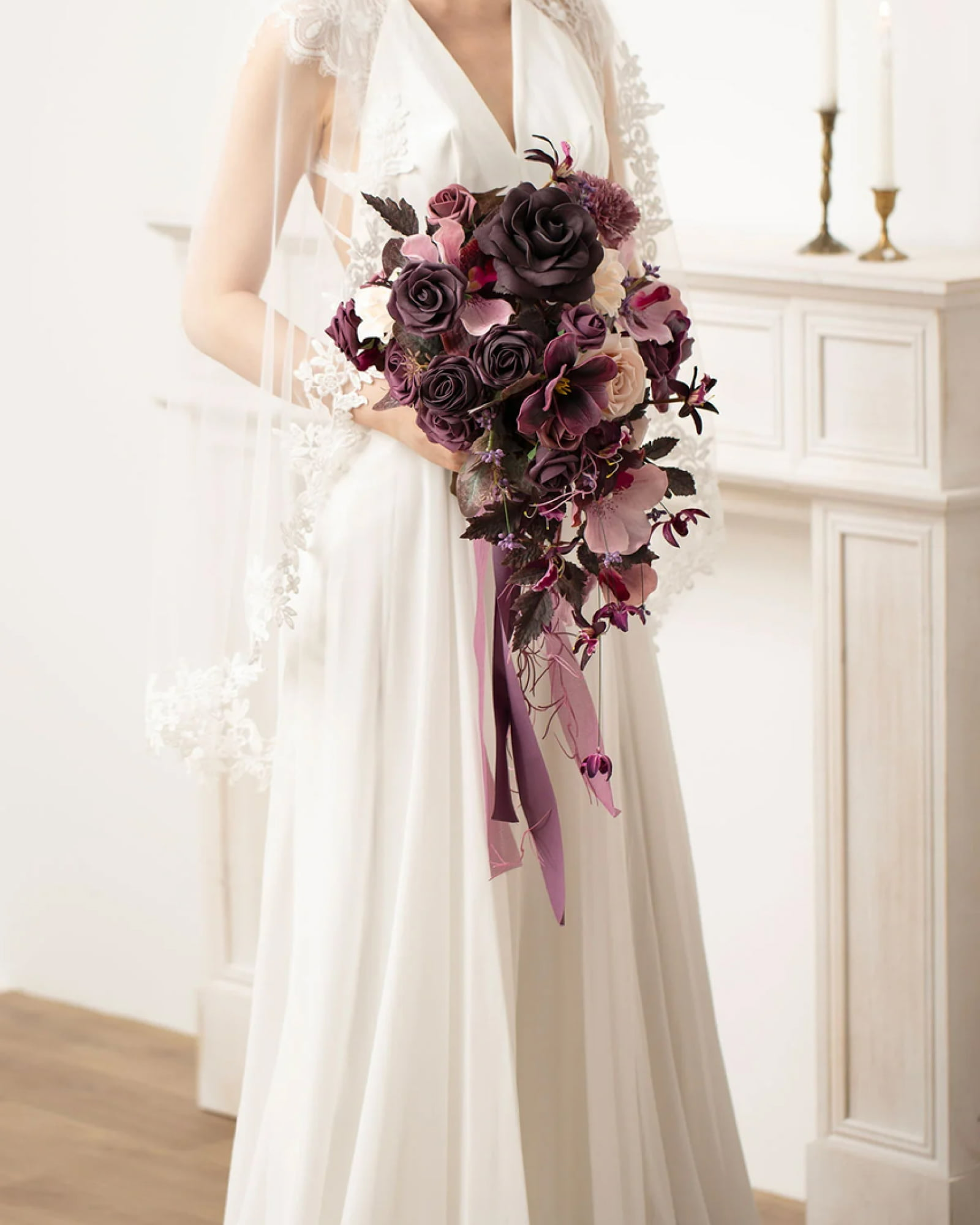
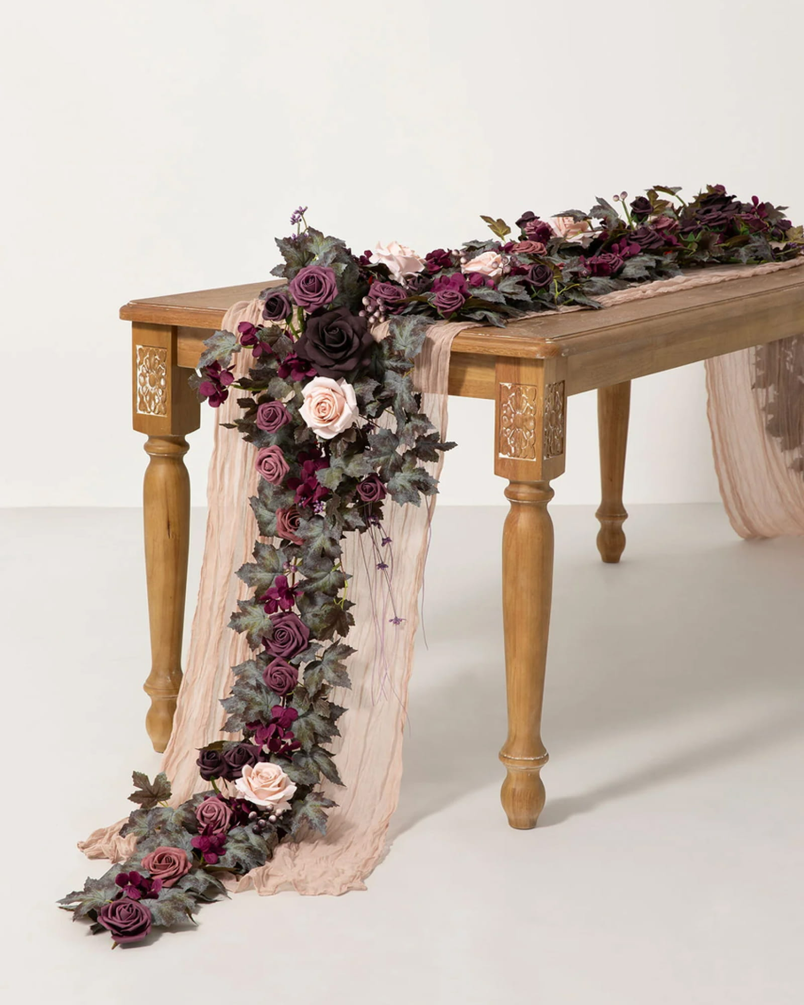
Industrial Plum & Dusty Rose
Plum and dusty rose bring a romantic edge to an industrial wedding, especially when the floral arrangements balance rich, dark blooms with softer pink and mauve flowers. The deeper plum tones give the flowers presence against raw materials, while dusty rose keeps the overall look from feeling too severe. Satin draping adds another layer of contrast, its fluid folds softening the harder lines of the space. The result feels romantic without losing the character of an industrial setting.
Shop the Look
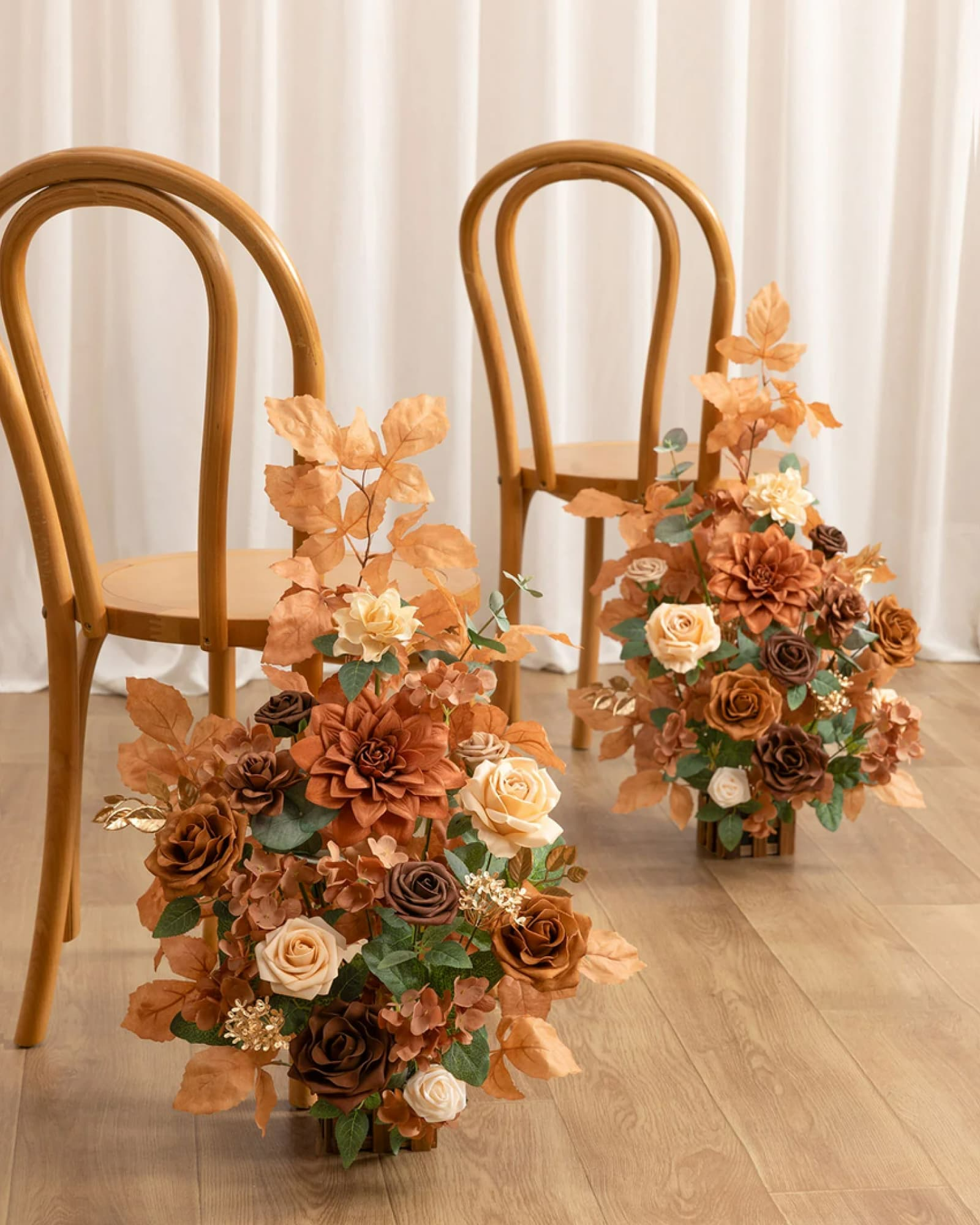
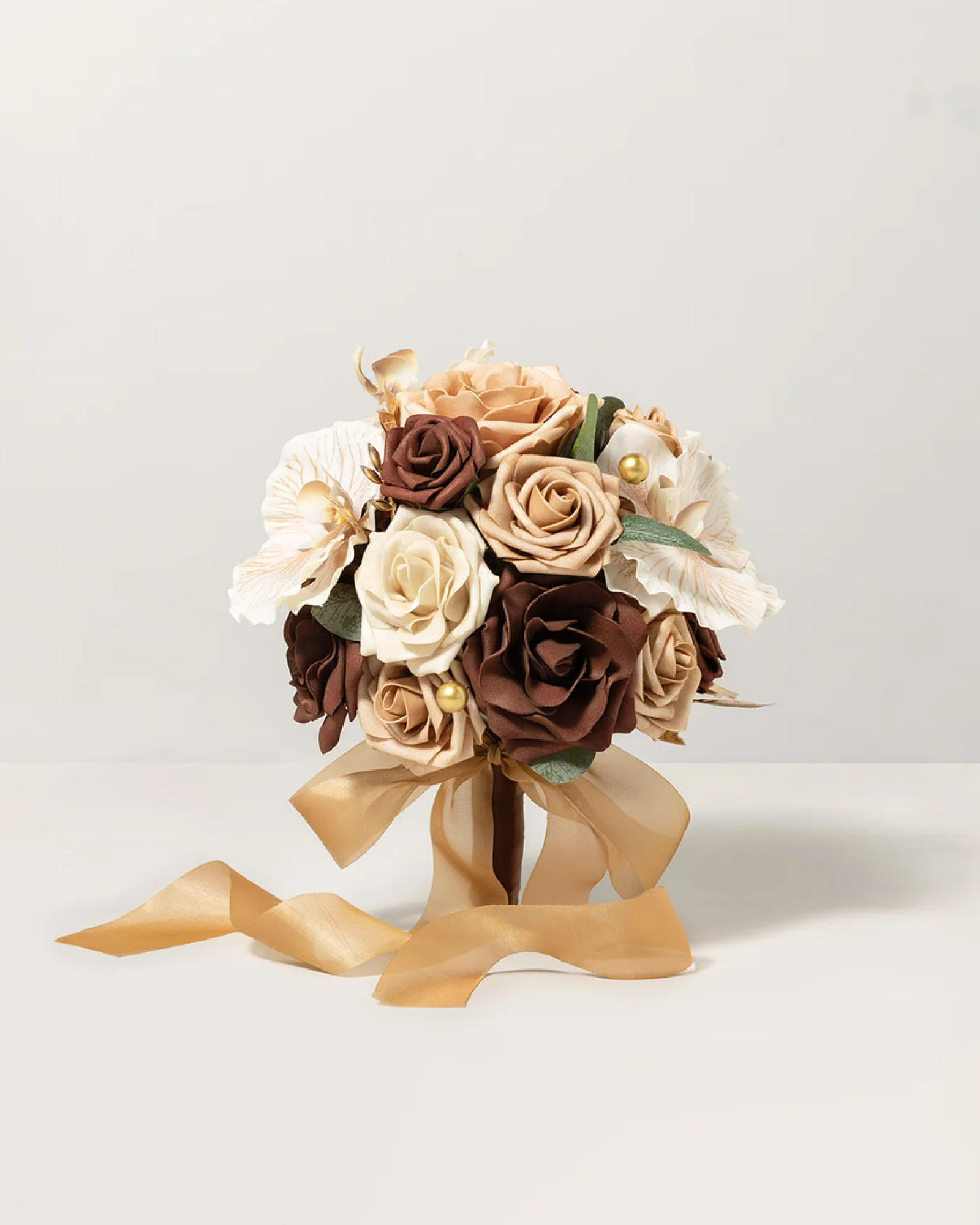
Opulent Walnut Brown & Beige
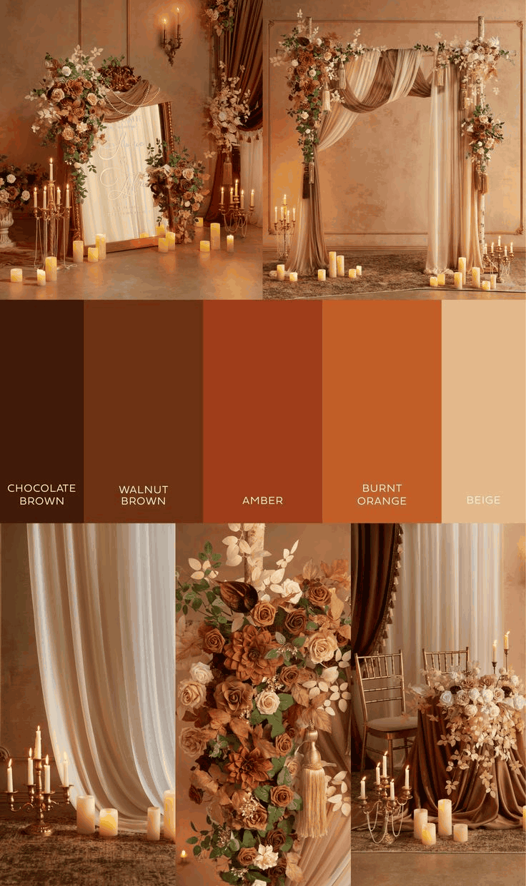
Walnut brown, caramel, and burnt orange create a warm foundation for this opulent look. Roses, dahlias, and textured foliage bring density to the floral arrangements, while beige and cream draping soften the darker colors. Then come the gold details: mirrored frames, tassels, and branching candelabras add a decorative richness that feels deliberately old-world. The beige matters just as much as the brown here. It gives the eye somewhere to rest and keeps the abundance of color and ornament from feeling too heavy.
Shop the Look
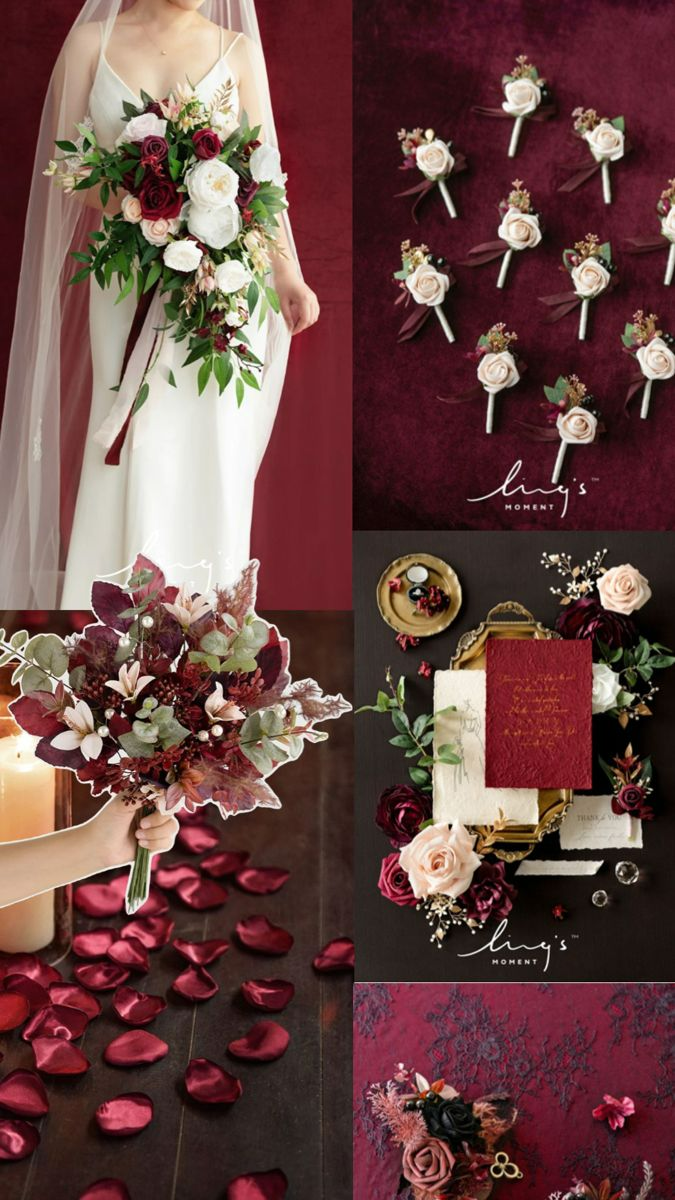
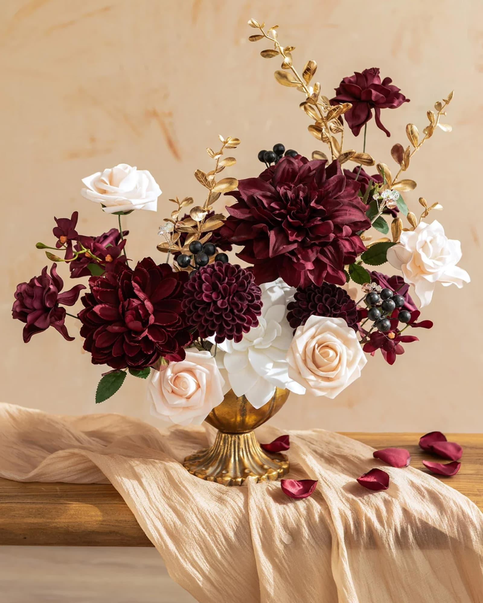
Sultry Marsala & Blush
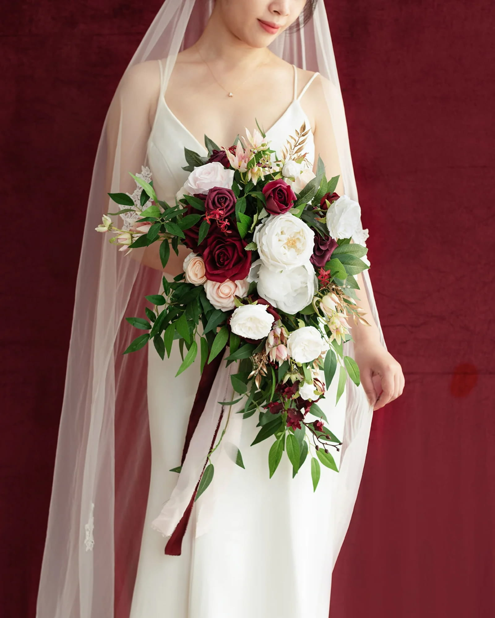
Marsala and burgundy flowers give this palette its depth, while blush flowers make the contrast feel more nuanced than an all-red arrangement. Dark berries and gold-toned foliage add smaller shifts in color and texture; Touches of white help distinguish individual blooms within the richer tones. Rather than competing with the deeper shades, blush creates a softer transition around them. It is a lovely direction for couples who want the intimacy of a rich floral palette with a distinctly romantic finish.
Shop the Look
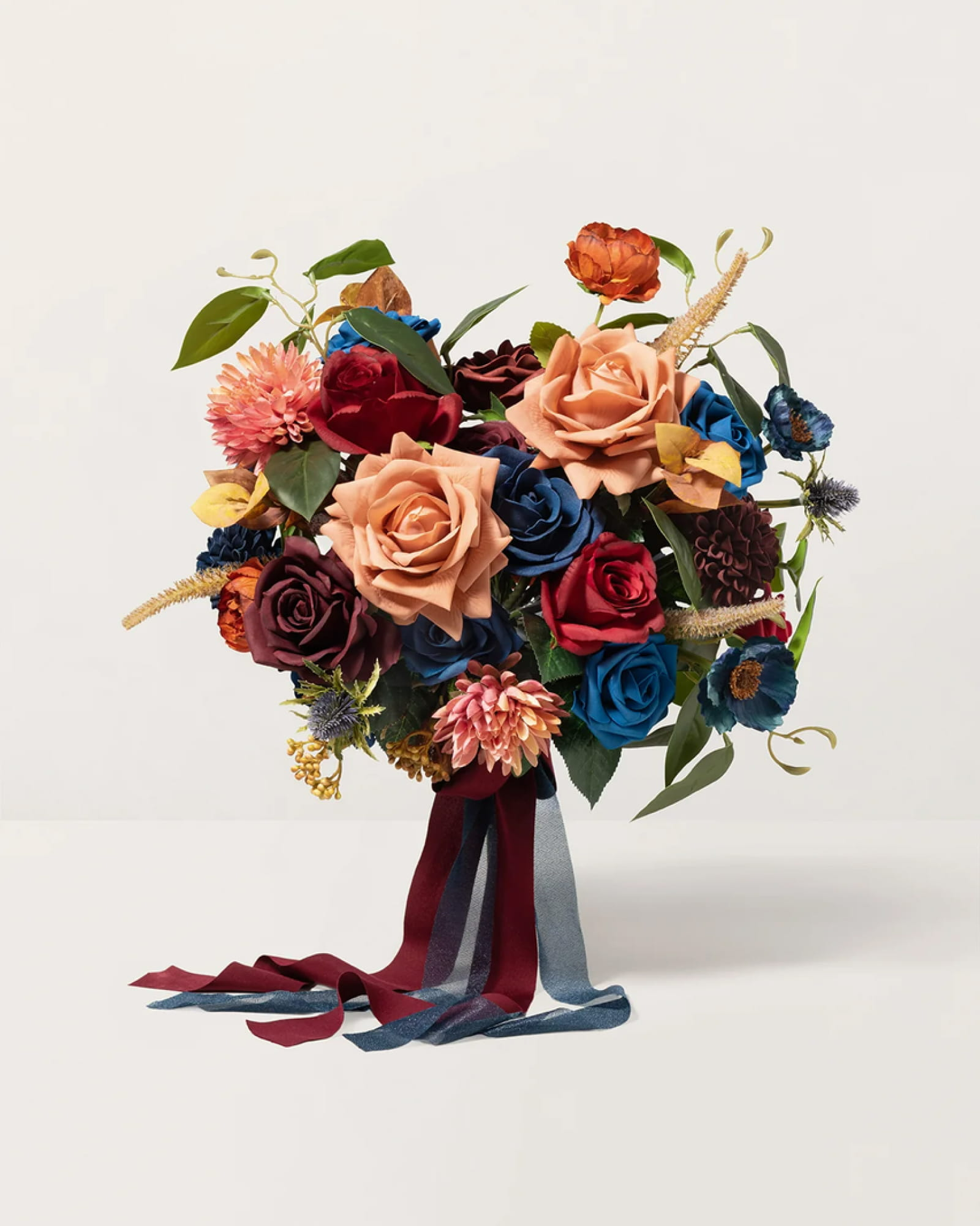
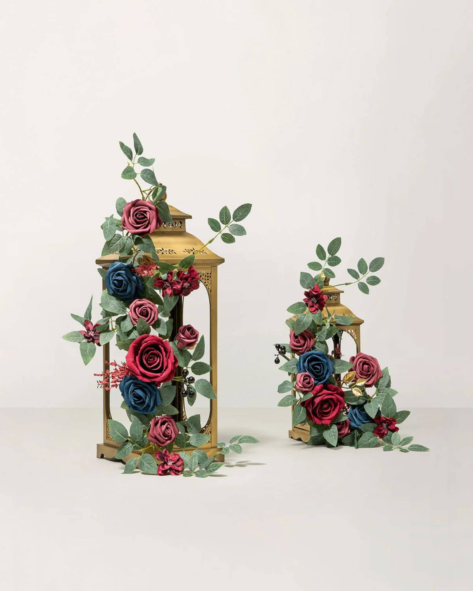
Painterly Burgundy & Navy & Burnt Orange
Burgundy, navy, and burnt orange bring several strong colors into one design. The challenge is deciding which should lead. Blue-toned blooms establish a cool foundation, while burgundy adds depth and burnt orange introduces a warmer focal point. Repeating selected colors in the surrounding decor can help the flowers feel connected to the wider setting. Think of the palette as a painting: each shade can be expressive, but they need different roles to make the whole composition work.
Shop the Look
4 Key Elements of Moody Wedding Decor
1.Build Around Deep, Rich Colors
Burgundy, plum, burnt orange, and jewel tones give a moody wedding its visual depth. Rather than relying on dark shades alone, pair them with softer colors like blush, cream, or beige to create contrast and keep the palette balanced.
2.Layer Textures Through Fabrics and Linens
Dark tablecloths, velvet runners, and satin draping can dramatically change the feel of a space. Velvet lends a rich, tactile quality, while satin introduces sheen and fluidity. Choose materials that complement your theme, whether that's sleek and modern or warm and vintage-inspired.
3.Add Metallic Accents with Intention
Gold, brass, and silver details can bring another layer of character to a moody palette. Gilded frames, metallic candleholders, and reflective tableware work particularly well against deep florals and dark linens. A few considered accents often have more impact than using metallic finishes everywhere.
4.Create Atmosphere with Candlelight
Lighting helps bring the entire design together. Taper candles, warm ambient lighting, and strategically placed uplighting can highlight floral arrangements, bring out the texture of fabrics, and create a more intimate setting. Consider how the lighting interacts with your chosen colors and materials so the details remain visible while the overall atmosphere feels warm and dramatic.
The most compelling moody weddings are built around a clear design vision, not simply a dark color palette. Start with the colors and flowers you’re drawn to, then use fabrics, table settings, and lighting to carry that look throughout the celebration. Explore our wedding flower collections to find blooms that fit your palette and bring your vision together.


