


Crafting an Elegant Pink Wedding with Seasonal Spring Florals
Spring brings a particular kind of romance—quiet, fresh, and unforced. Light feels softer, colors appear gentler, and nature itself provides a sense of ease that doesn’t need much embellishment. This pink wedding began with that atmosphere in mind. Set in a peaceful country villa garden, the surrounding greenery and warm daylight shaped the overall direction before any design decisions were made.
Rather than starting with a fixed theme, we focused on how the space felt in spring and how flowers and fabrics could respond to it. The goal was to create a spring wedding that felt relaxed and intimate, where every detail supported the season rather than competed with it. From florals to draping, each choice followed a sense of flow—allowing elements to feel connected, natural, and quietly romantic throughout the day.
The Art of the Powder Pink Wedding Color Palette
Why Powder Pink Works Best as a Foundation Color
In this design, powder pink was never meant to stand alone, but to act as a soft foundation throughout the pink wedding—something that subtly warms the space and softens transitions between materials. Powder pink has a unique ability to adapt: in natural light it appears airy and refined, while alongside greenery and neutrals it feels grounded rather than sweet.
This approach is especially effective for a spring wedding. When pink is layered gently through florals and fabrics, it enhances the season’s natural beauty instead of overpowering it. Powder pink becomes part of the environment—supporting movement, texture, and light—rather than demanding attention.
Balancing Pink with Cream and Sand Beige
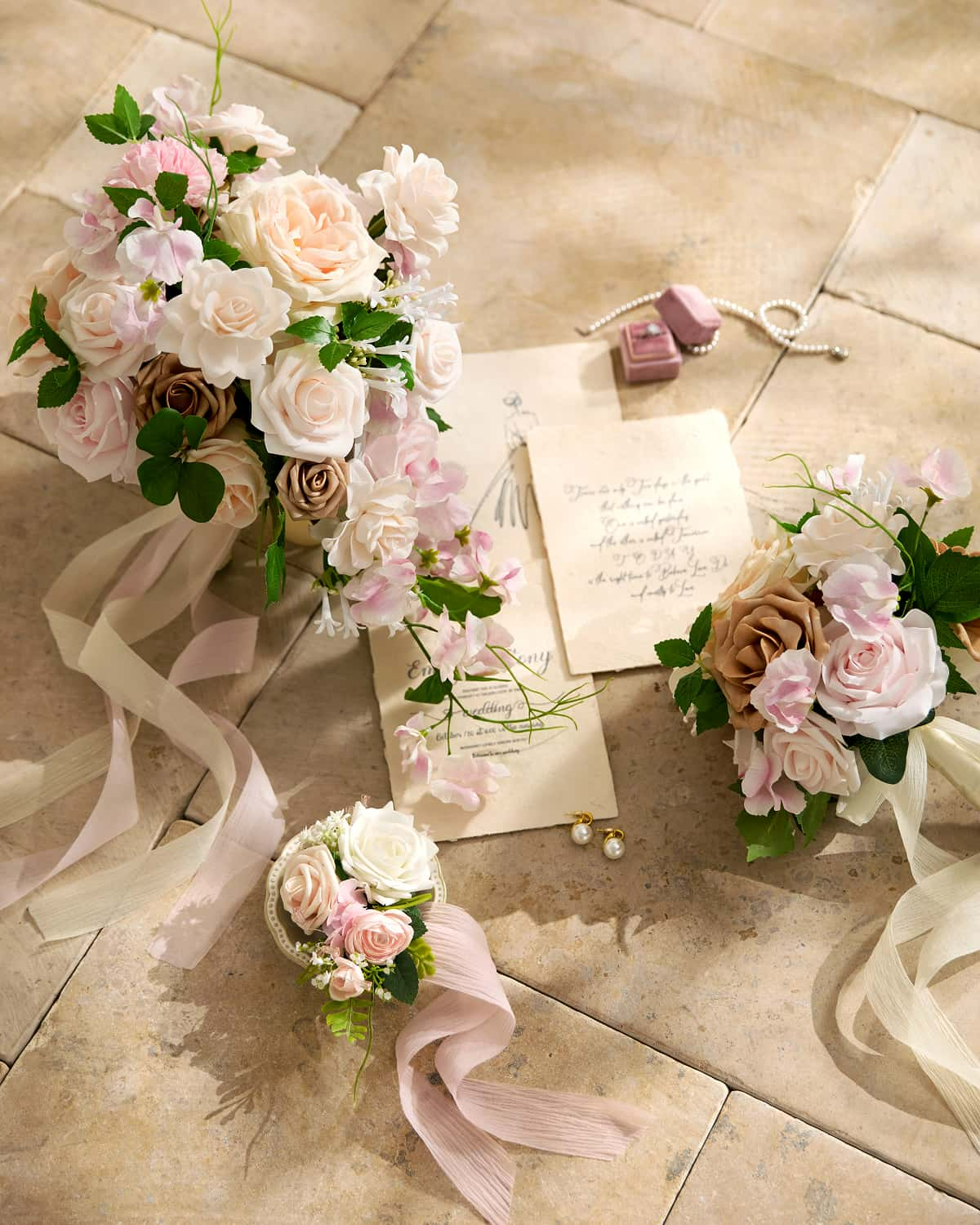
Cream and sand beige were essential in giving the palette depth and stability. These tones create breathing room between pink elements, allowing the eye to rest and making each floral moment feel intentional. Beige linens, neutral fabrics, and soft wood details helped anchor the design, ensuring the powder pink wedding color palette felt elegant rather than decorative.
This balance also makes the palette highly adaptable. Whether used in a garden, villa, or indoor venue, powder pink paired with warm neutrals can be scaled up or down easily—giving couples flexibility to mix and match elements while maintaining a cohesive look.
The Bridal Party Styled in Harmony
A Bridal Look That Echoes Simplicity and Ease
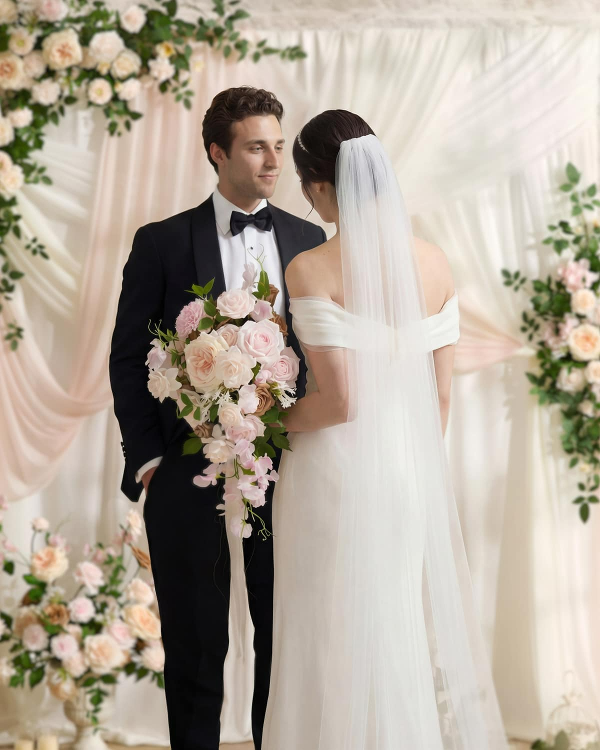
The bridal party styling was approached as an extension of the overall powder pink wedding color palette and material story rather than a separate design element. The bride wore a minimalist off-shoulder gown with subtle detailing, allowing the clean silhouette to echo the softness of the surrounding florals and fabrics. The simplicity of the look helped maintain a sense of ease and balance throughout the day.
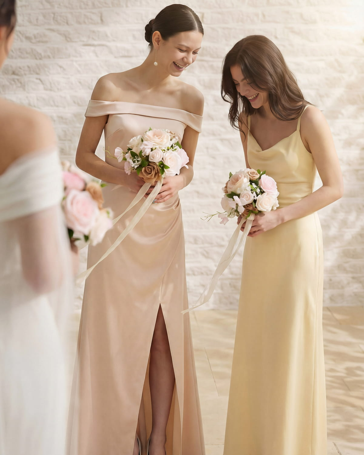
Bridesmaid Colors That Move Naturally with the Palette
Bridesmaids were dressed in soft satin gowns in blush, champagne, and pale yellow tones. Rather than matching exactly, these hues were chosen to sit comfortably within the floral palette, adding warmth and gentle variation as the group moved through the garden. Together, the bridal party introduced subtle shifts in color and texture, reinforcing the relaxed, spring wedding atmosphere while keeping the overall look cohesive and natural.
Spring Wedding Floral Design Inspired by Movement
Establishing Shape Before Softness
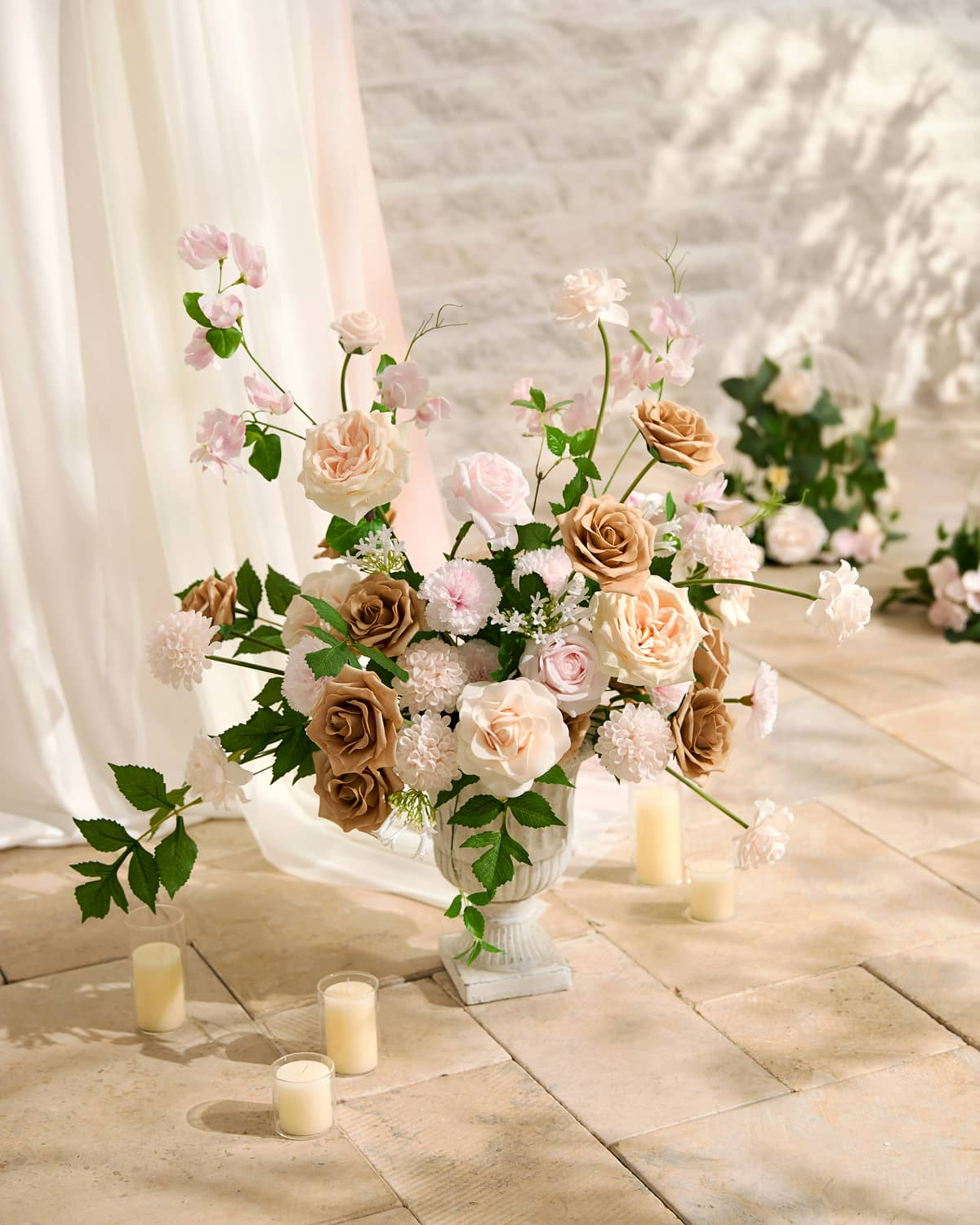
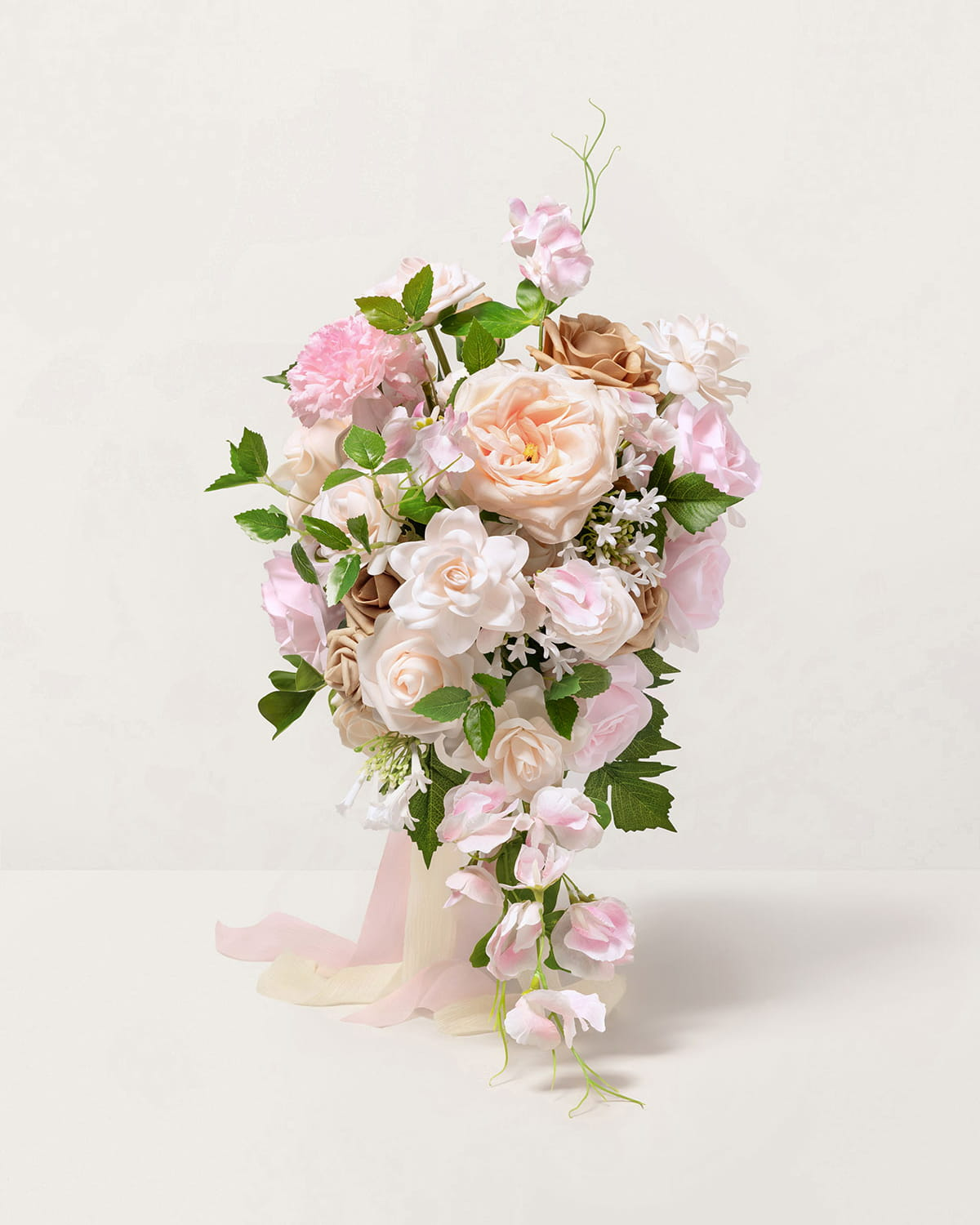
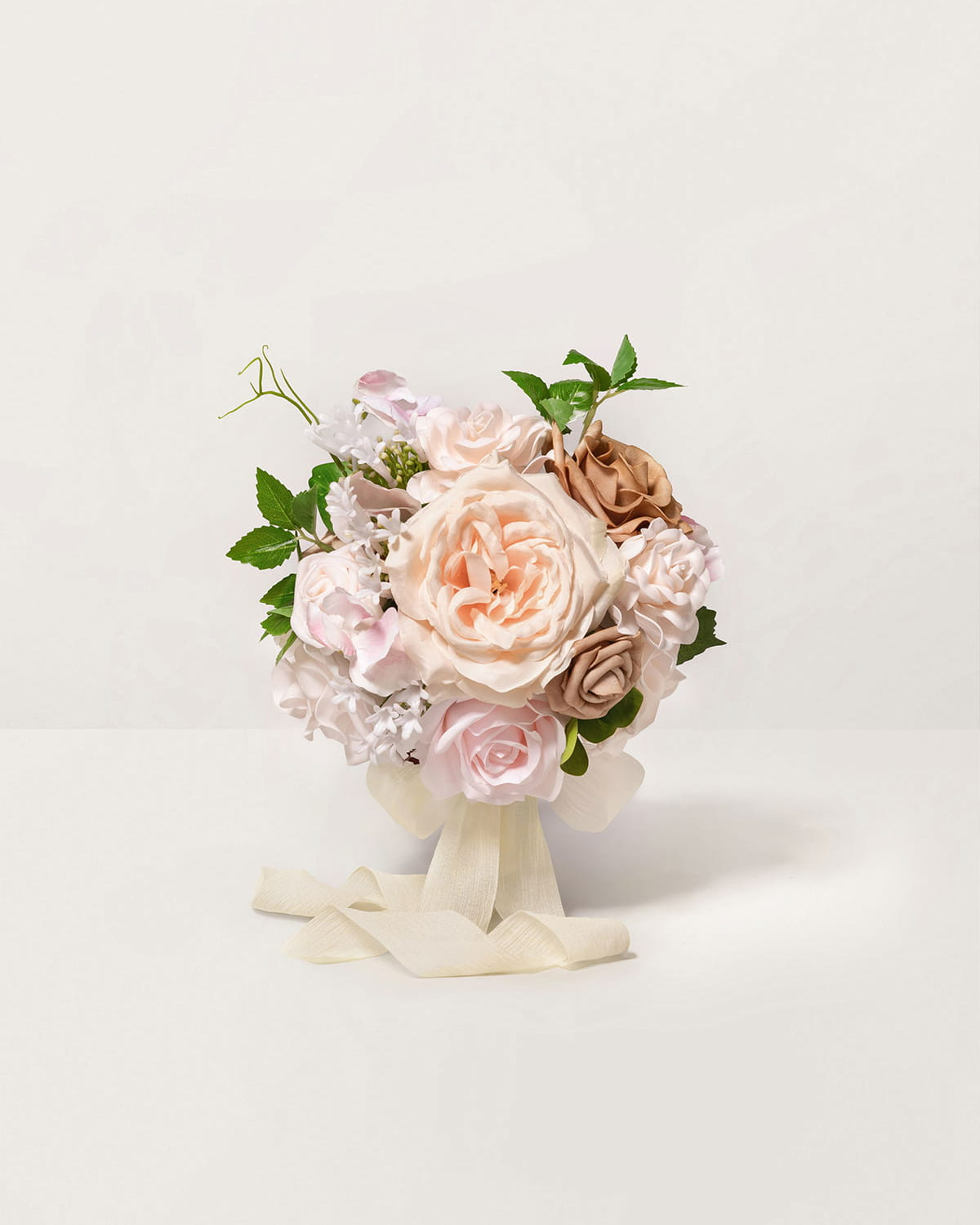
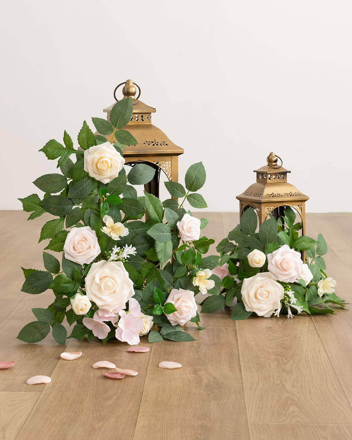
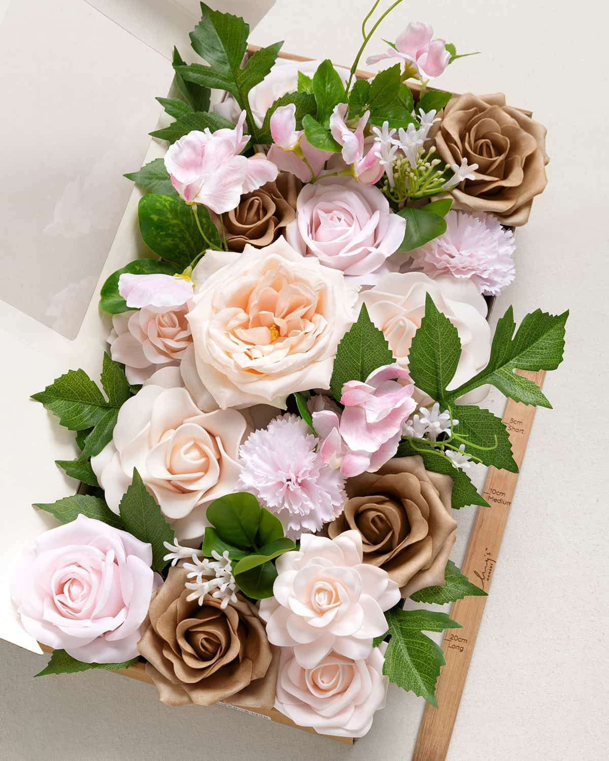
Structure came first. Lifelike roses provided the visual backbone of the arrangements, offering stability and a sense of order. Their presence ensured that even looser compositions felt deliberate rather than casual.
Once that structure was established, we allowed the florals to open up—embracing asymmetry and natural lines. This balance between form and looseness is what keeps spring wedding florals feeling refined without becoming rigid, especially in a pink wedding setting.
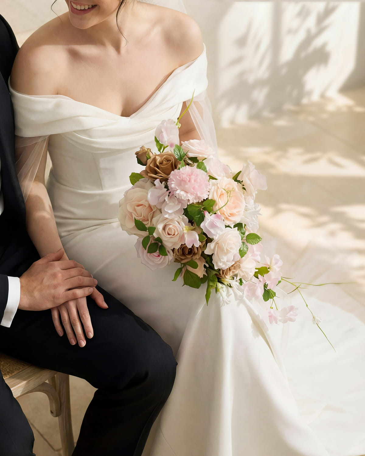
How Sweet Peas Bring Lightness and Flow
Realistic sweet peas played a key role in softening the overall floral look. Their delicate stems and organic movement introduce a sense of air, making arrangements feel lighter and more seasonal. In a powder pink wedding color palette built around soft pink tones, this quality prevents the design from feeling heavy or overly styled.
The natural movement of sweet peas helped this spring wedding floral design feel fluid rather than structured. Repeating sweet peas across bouquets, installations, and tables created a sense of continuity without visual heaviness, allowing each floral moment to feel connected yet effortless.
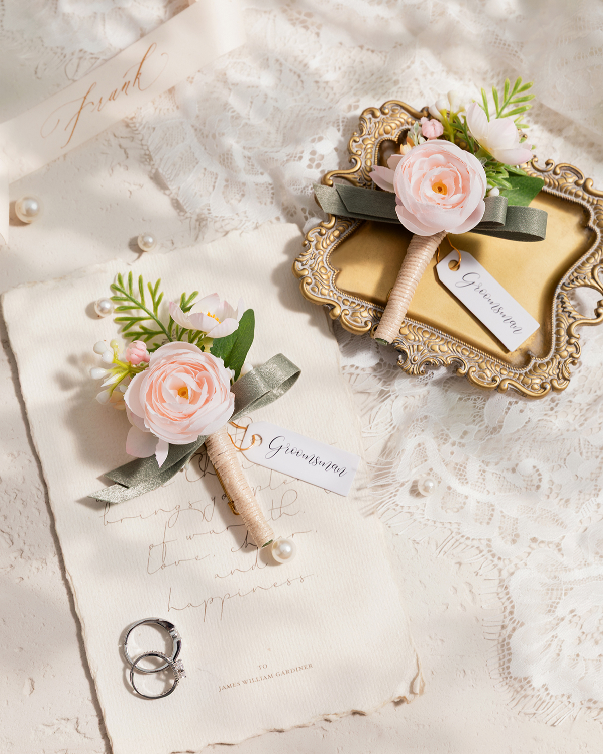
Related Product:
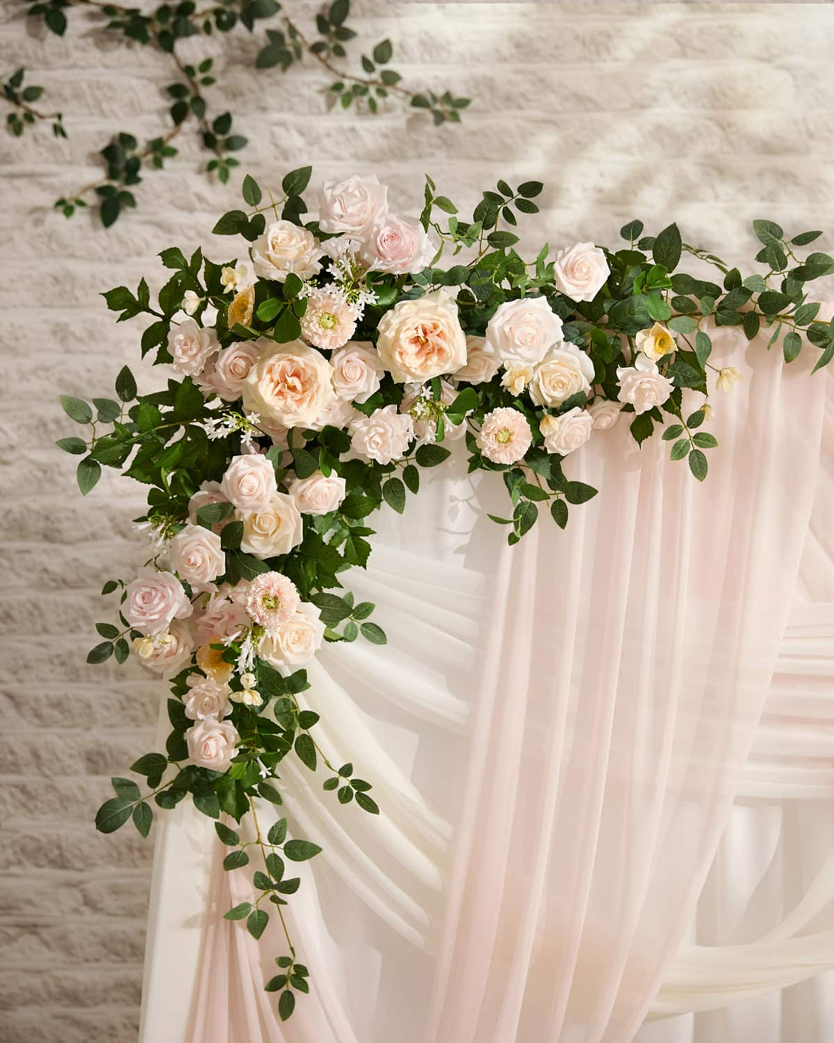
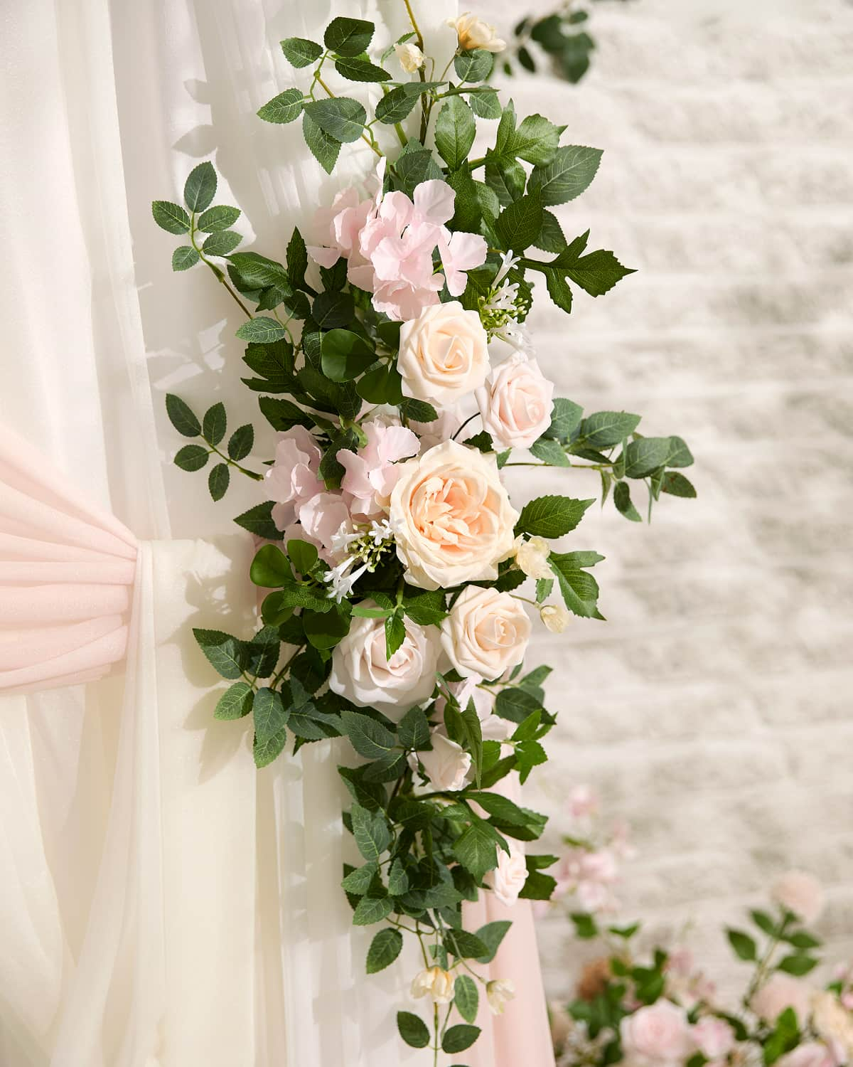
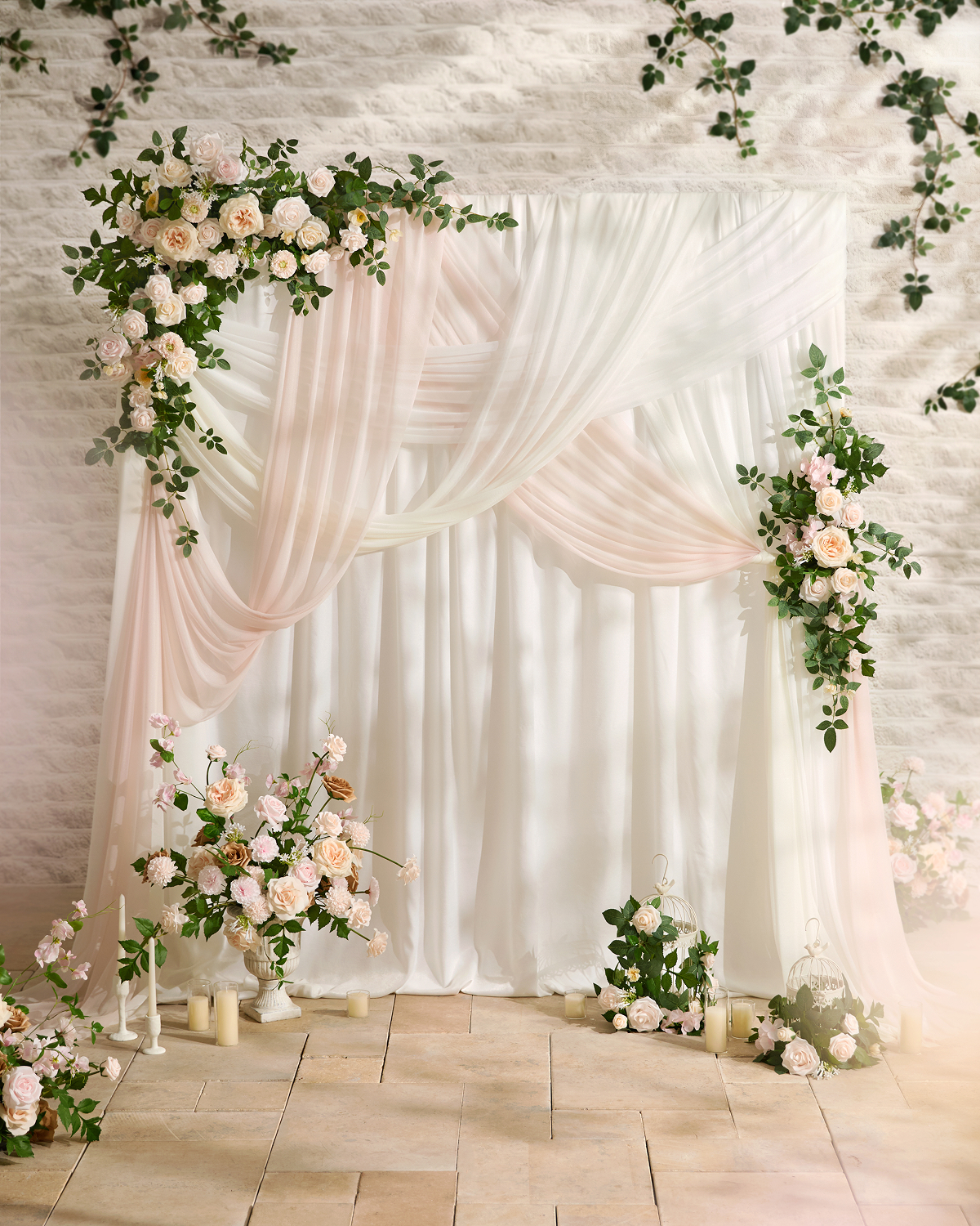
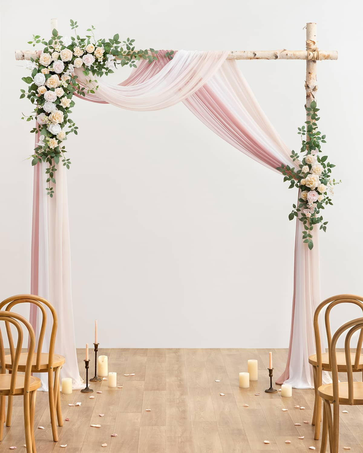
Ceremony Styling with Wedding Draping That Feels Natural
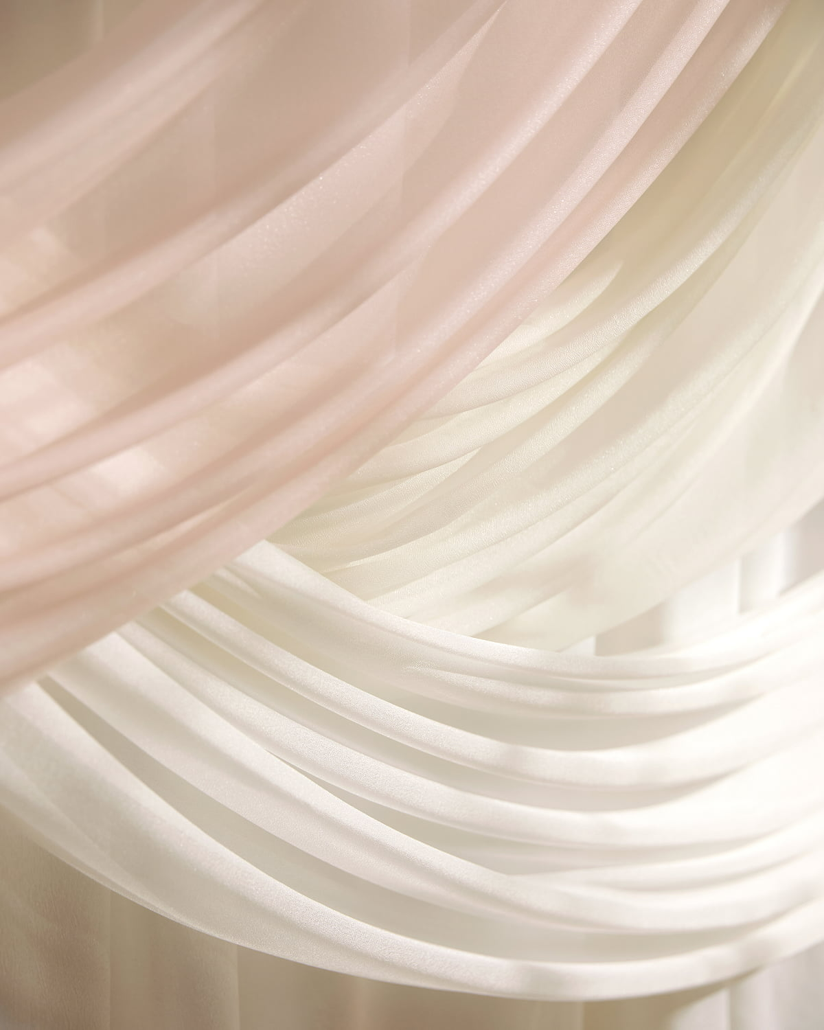
Using Draping to Shape, Not Fill
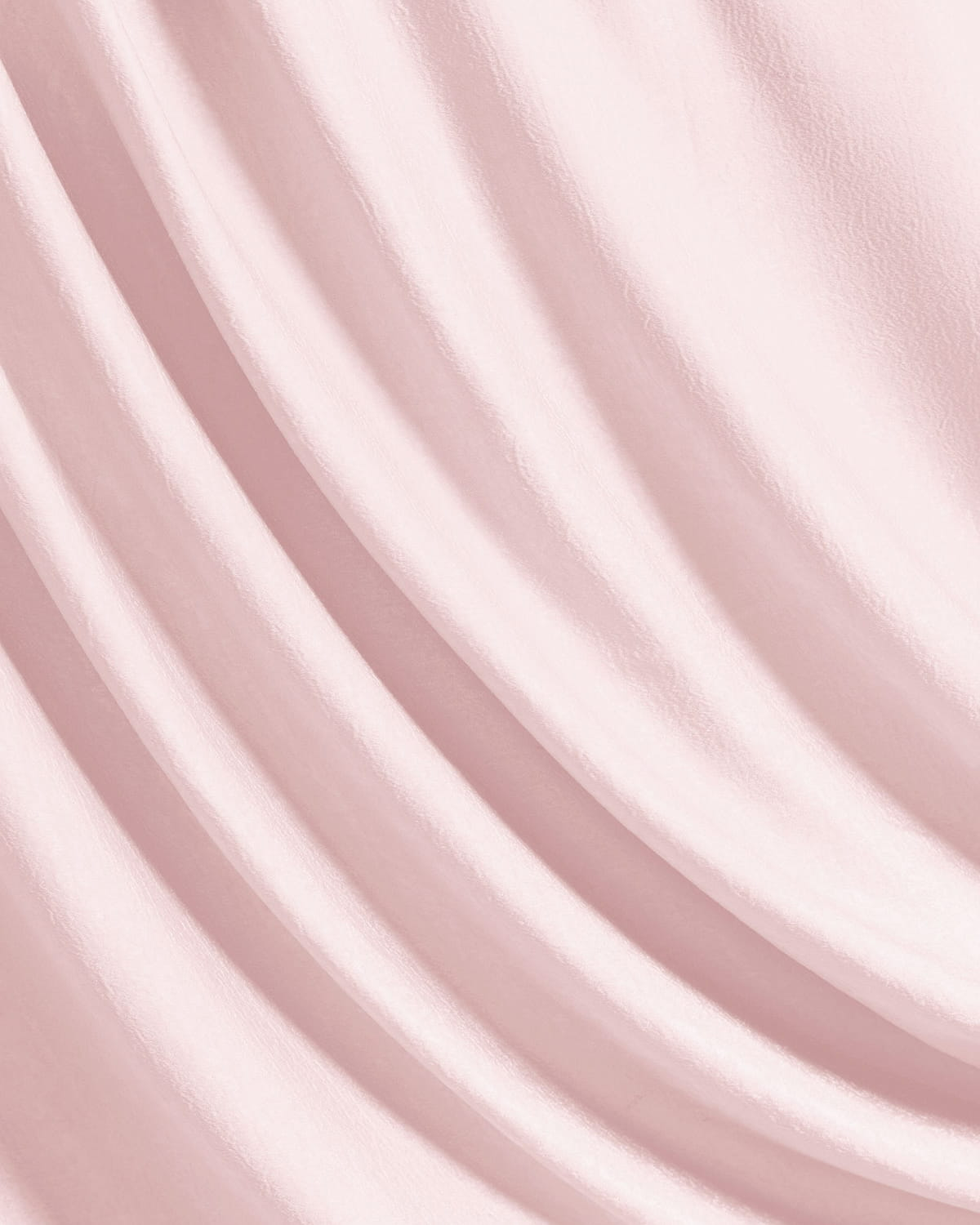
Wedding draping was approached as a structural tool rather than decoration. A layered cross-flow technique helped frame the ceremony area while preserving openness. The fabric moved gently with the surroundings, echoing the softness of the garden rather than enclosing it.
This method works particularly well for a pink wedding set in a natural environment, where the setting already provides depth and texture. Draping simply guides the eye and defines the moment without overwhelming it.
Combining Florals and Negative Space Thoughtfully
Florals were placed strategically to anchor the draping, while negative space behind the couple was left intentionally clear. This contrast keeps the focus on the ceremony itself and allows details to feel meaningful rather than excessive.
By allowing florals, fabric, and open space to work together, the ceremony felt intimate and calm—detailed up close, but clean and composed from a distance.
Related Product:

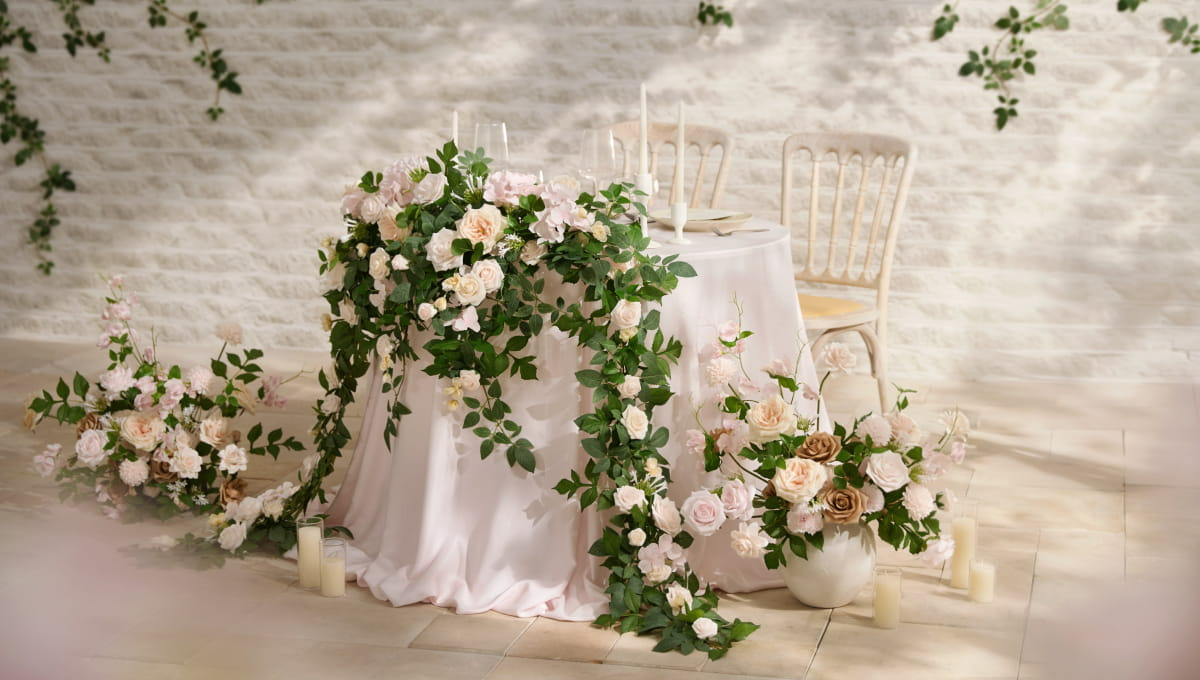
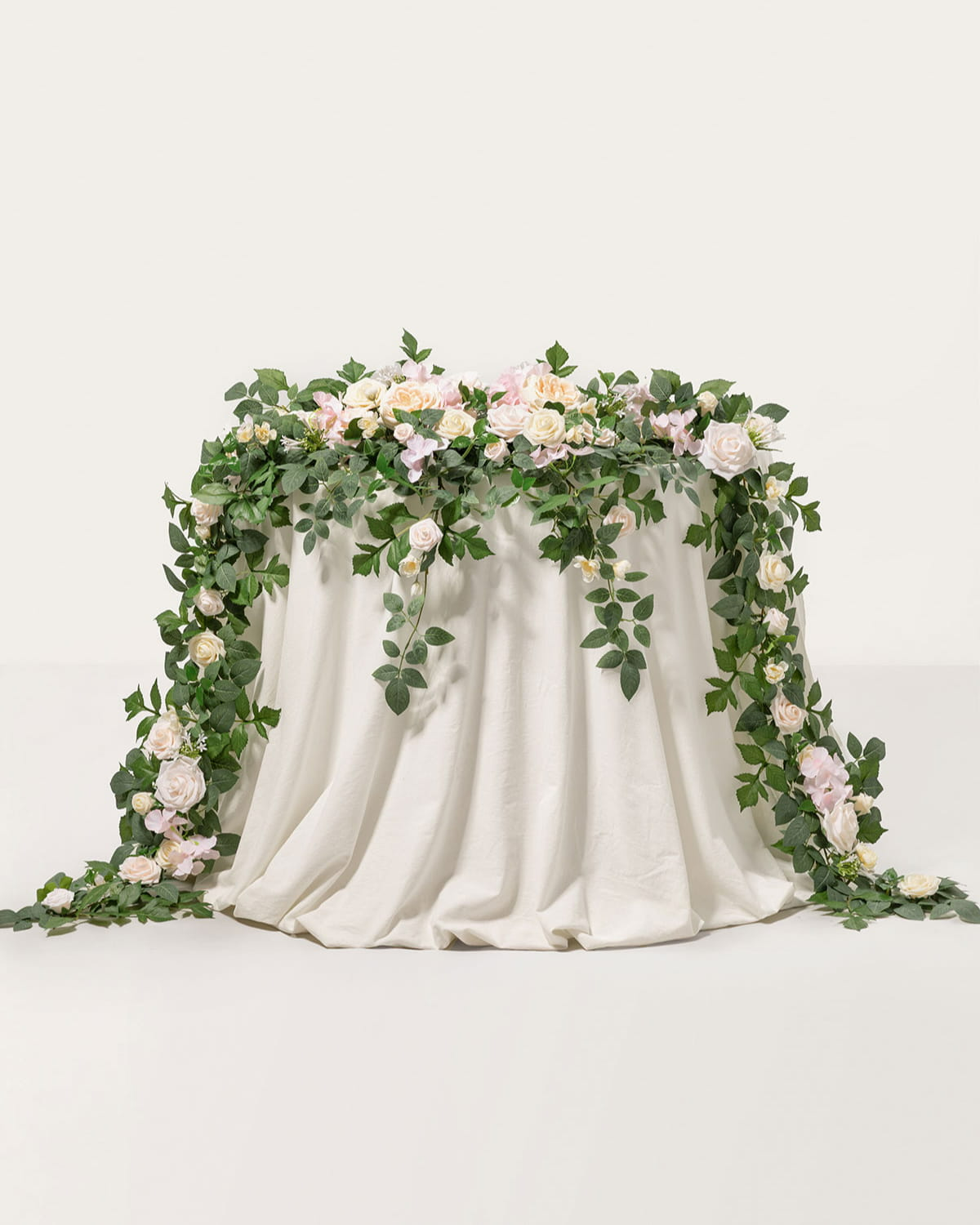
Sweetheart Table Styling That Feels Connected and Intentional
Letting Florals Extend Beyond the Tabletop
At the sweetheart table, florals were designed to cascade naturally off the surface instead of remaining contained. This approach mirrors the movement seen in the ceremony draping and reinforces the relaxed tone of the pink wedding. Allowing florals to spill downward also helps visually connect the table to the surrounding space.
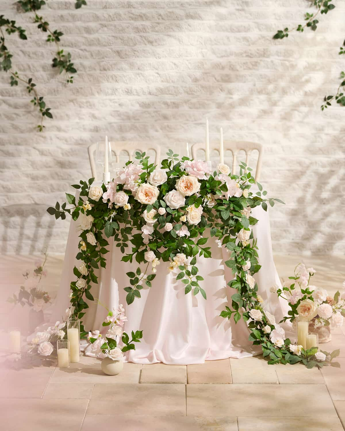
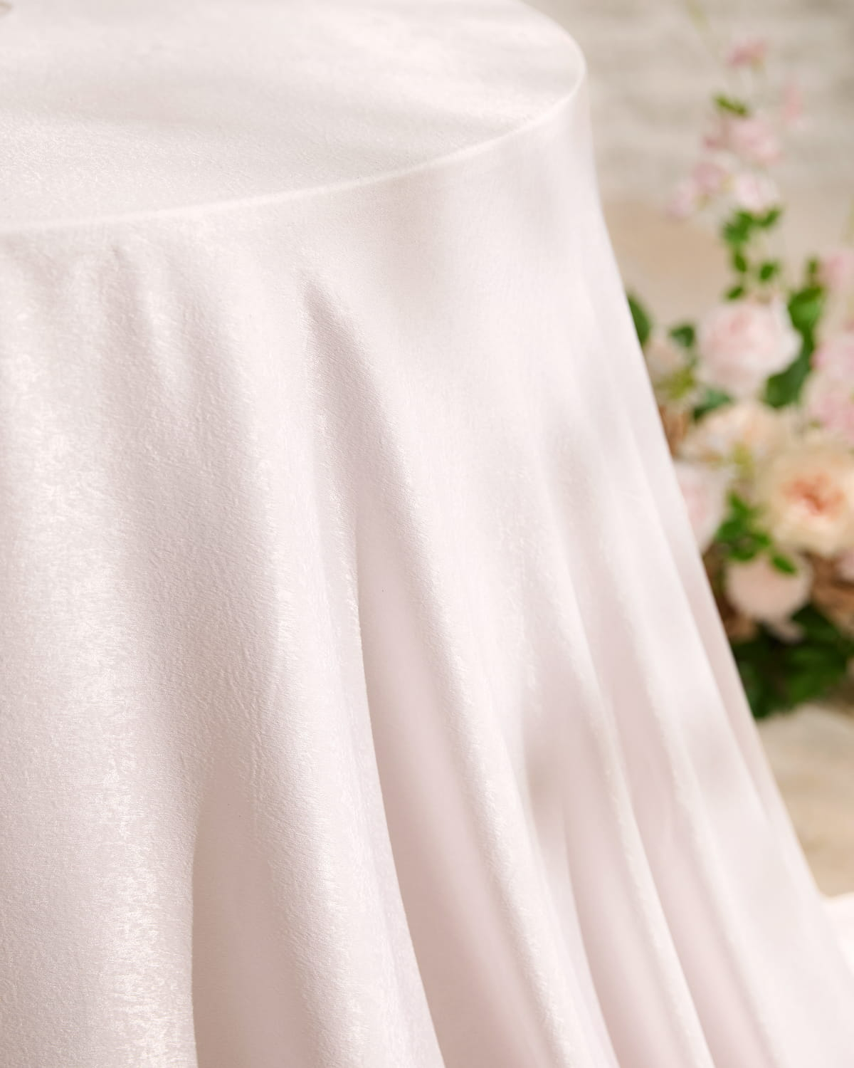
Using Fabric to Create Continuity Across Scenes
Soft, pooling linens played an important role in tying the table to the rest of the design. Rather than repeating the ceremony setup exactly, the same fabrics were styled differently—showing how materials can shift in character depending on placement and scale. This flexibility encourages couples to see fabrics as creative tools that can be mixed and matched to suit different moments throughout the day.
Related Product:
Final Thoughts: Making This Pink Spring Wedding Your Own
This wedding reflects the beauty of the season, where fresh blooms, greenery, and a garden setting come together to create an intimate, romantic atmosphere.
The strength of this wedding lies in its simplicity. A balanced powder pink wedding color palette, seasonal florals featuring elements like sweet peas and restrained wedding draping form a foundation that can be adapted to many settings without losing its essence. Rather than copying each detail, couples can take inspiration from how elements interact. By adjusting scale, color balance, or placement, flowers and fabrics become creative starting points—helping shape a celebration that feels personal, confident, and naturally romantic.